3 A transparent rail at the front edge |
|
| |
of the feeder unit allows paper to be |
|
| |
inserted more easily. |
|
| |
4 The feeder icons attached to the |
|
| |
vertical rail at the back of the feeder unit | 3 | 4 | |
are visible at wheelchair height. | |||
6 | 7 | ||
| |||
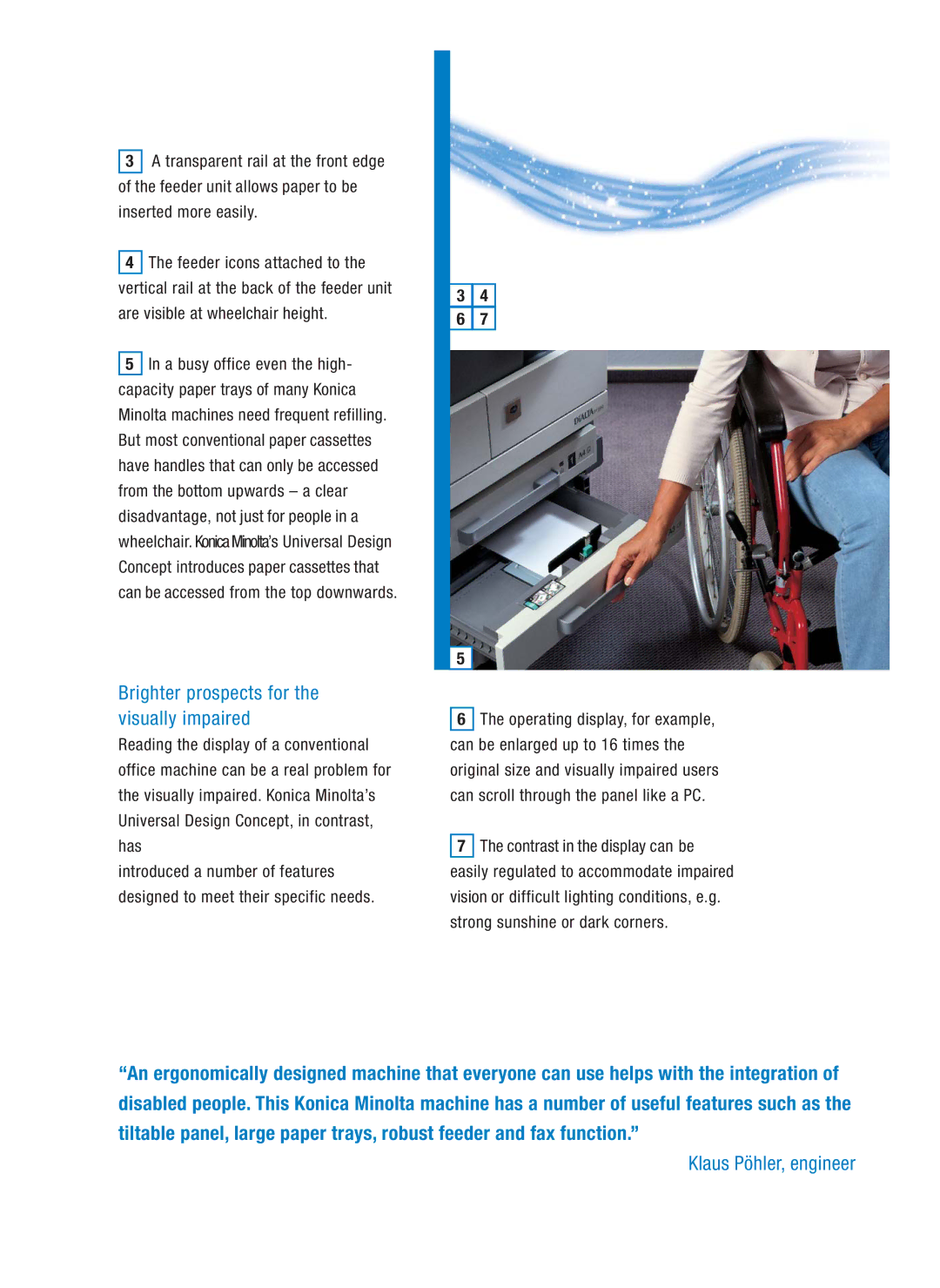
5 In a busy office even the high- |
|
| |
capacity paper trays of many Konica |
|
| |
Minolta machines need frequent refilling. |
|
| |
But most conventional paper cassettes |
|
| |
have handles that can only be accessed |
|
| |
from the bottom upwards – a clear |
|
| |
disadvantage, not just for people in a |
|
| |
wheelchair. KonicaMinolta’s Universal Design |
|
| |
Concept introduces paper cassettes that |
|
| |
can be accessed from the top downwards. |
|
| |
| 5 |
|
Brighter prospects for the visually impaired
Reading the display of a conventional office machine can be a real problem for the visually impaired. Konica Minolta’s Universal Design Concept, in contrast, has
introduced a number of features designed to meet their specific needs.
6The operating display, for example, can be enlarged up to 16 times the original size and visually impaired users can scroll through the panel like a PC.
7The contrast in the display can be easily regulated to accommodate impaired vision or difficult lighting conditions, e.g. strong sunshine or dark corners.
“An ergonomically designed machine that everyone can use helps with the integration of disabled people. This Konica Minolta machine has a number of useful features such as the tiltable panel, large paper trays, robust feeder and fax function.”
