Menu Elements
Highlight
Title bar
Tab
Check box
Drag | Tool bar |
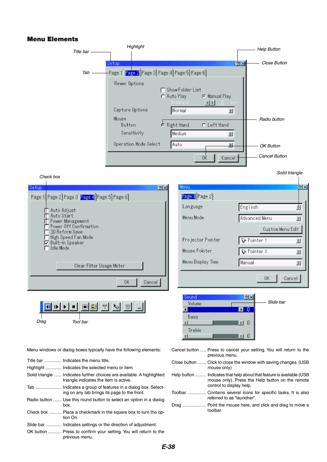
Menu windows or dialog boxes typically have the following elements:
Title bar | Indicates the menu title. |
Highlight | Indicates the selected menu or item. |
Solid triangle | Indicates further choices are available. A highlighted |
| triangle indicates the item is active. |
Tab | Indicates a group of features in a dialog box. Select- |
| ing on any tab brings its page to the front. |
Radio button | Use this round button to select an option in a dialog |
| box. |
Check box | Place a checkmark in the square box to turn the op- |
| tion On. |
Slide bar | Indicates settings or the direction of adjustment. |
OK button | Press to confirm your setting. You will return to the |
| previous menu. |
Help Button
Close Button
Radio button
OK Button
Cancel Button
Solid triangle
Slide bar
Cancel button | Press to cancel your setting. You will return to the |
| previous menu. |
Close button | Click to close the window with saving changes. (USB |
| mouse only) |
Help button | Indicates that help about that feature is available (USB |
| mouse only). Press the Help button on the remote |
| control to display help. |
Toolbar | Contains several icons for specific tasks. It is also |
| referred to as “launcher”. |
Drag | Point the mouse here, and click and drag to move a |
| toolbar. |
