Manuals
/
Fujitsu Siemens Computers
/
Computer Equipment
/
Computer Monitor
Fujitsu Siemens Computers
Notes on ergonomic colour adjustment, Colour monitor B15-1, white
Models:
B15-1
1
18
24
24
Download
24 pages
22.06 Kb
15
16
17
18
19
20
21
22
Troubleshooting
Connecting the monitor
Preset operating modes
Accessories
Adjusting rake and rotation
Changing the monitor settings
Cleaning
Adjusting the volume
Safety
Power cable
Page 18
Image 18
Page 17
Page 19
Page 18
Image 18
Page 17
Page 19
Contents
Contents
Page
Introduction
Target group
Additional information
Notational conventions
Safety notes
Important notes
Colour monitor B15-1
Cleaning
Transport
CE marking
Power cable
Energy Star Guidelines
FCC Class B Compliance Statement
Disposal and recycling
Checking the contents of the consignment
Installing an ergonomic video workstation
Connecting the monitor
Connecting cables to the monitor
Connecting cables to the computer
Adjusting rake and rotation
Operation of the monitor
Stage
Switching the monitor on/off
Notes on power management
Energy-saving mode
Changing the monitor settings with the buttons of the control panel
Changing the monitor settings
Basic monitor settings with the floppy disk supplied
Performing auto-adjustment of the monitor
Activating/deactivating muting
Monitor settings using the OSD menu
Adjusting background lighting
Locking the OSD menu
Adjusting the brightness and contrast
Adjusting size and position
Setting display of the OSD menu
Adjusting the volume
Setting colour temperature and colours
Native
Setting functions in the Advanced menu
Displaying information
cyan
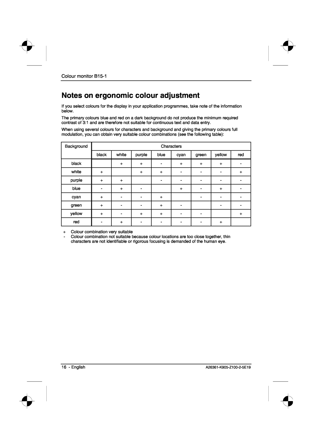
Notes on ergonomic colour adjustment
white
green
Removing the monitor base
Accessories
Technical data
Dimensions and weight LCD monitor
Storable display modes
Preset operating modes
VESA-DDC-compatible VGA interface
Pin assignment D-SUB
Trouble shooting
Having this problem?
Meaning
Please change the display mode to
Frequency out of range
## kHz / ## Hz
1024x768 with 60 Hz
Permanently unlit or lit pixels
Top
Page
Image
Contents