User’s guide
Edition Part Number F2224-90001
Printing History
Edition December
Contents
About the Solve aplet
Using variables in equations
Plotting a piecewise-defined function
Getting started with the Polar aplet
10-7
Confidence intervals One-Sample Z-Interval
One-Proportion Z-Interval
11-1
Variables and memory management
Creating and editing programs 16-4
16-1
16-2
16-7
Operating details
Glossary Resetting the hp 39g+
Service Regulatory information
Variables Home variables
Hewlett Packard’s Calculators web site can be found at
Preface
Manual conventions
Function, Polar, Parametric
Preface
Getting started
On/off, cancel operations
To cancel
To turn on
Parts of the display
To adjust
Display
Contrast
Infrared or cable
Keyboard
Menu keys
Aplet control keys
Displays the Aplet Library menu. See Aplet library on
Button performs
Entry/Edit keys
Same
Shifted keystrokes
Helpwith
Math keys
Program
Commands
Menus
Inactive keys
Reset input form values
Input forms
Current aplet and Home give
Mode settings
You use the Modes input form to set the modes for Home
Same result
Lists and matrices, and to separate
Setting Options Number
Function arguments. Comma mode
Uses periods dot as separators
Press to return to Home
Setting a mode
Aplets E-lessons
Sequence Sequence functions U in terms of n, or
Example x = cost and y = sint
Polar
Another sequence, such as Un 1
Quad Explorer aplet
Seen by experimenting
Keys Transforms Graph, with these
Amplitude and frequency
Aplet views
Symbolic view
Aplet library
Select Plot-Detail
Plot view Numeric view Plot-Table view Plot-Detail view
Select Plot-Table
Overlay Plot view Sketch view
Aplet view configuration
Plot Setup
Views menu contains the Overlay Plot view
Mathematical calculations
Numeric Setup Symbolic Setup
Where to start
Entering expressions
23 3 EEX
Long results Negative numbers Scientific notation powers
Using
Entering Calculates Sin 45 + π
Explicit and implicit multiplication
Parentheses
Input Output Last input Edit line Last output
Getting started
Storing a value in a variable
Setting Fraction mode
Using fractions
Accessing the display history Clearing the display history
Setting fraction precision
Fraction
Fraction calculations
Select
Converting decimals to fractions
Complex numbers
Catalogs and editors
Aplets and their views
About the Symbolic view
Defining an expression Symbolic view
Aplet views
Independent variable in the expressions is T
U0. Define the nth term
Select Function
Evaluating expressions
Aplets
Home
Setting up the plot Plot view setup
About the Plot view
ΘSTEP
Plot view settings
ΘRNG
Reset plot settings
Exploring the graph
Trace a graph
To move between relations
Zoom options
Zoom within a graph
To jump directly to a value To turn trace on/off
Factors
Square
Set
Auto Scale
Un-zoom
Now un-zoom
One diagonal of the zoom rectangle
To box zoom
Box Zoom option lets you draw a box around
To turn on the menu-key
Press to zoom in on the boxed area
Other views for scaling and splitting the graph
Views menu options
Press or
Split the screen
Pixel=π/24 radian, 7.58, or
About the numeric view
Setting up the table Numeric view setup
Numeric view settings
Numstart and Numstep
Exploring the table of numbers
NUM view menu keys Zoom within a table
Numtype Build Your Own
Building your own table of numbers
Build a table
Build Your Own menu keys
Clear data
Plot the circle, x 2+ y 2 = 9. First rearrange it to read
Reset the graph setup to the default settings
Example plotting a circle
Function aplet, specify the functions
Display the functions in numeric form
Getting started with the Function aplet
Function aplet
About the Function aplet
Open the Function aplet
Specify a grid for the graph
Define the expressions Set up the plot
Plot the functions
Plot the functions
Scale
Change the scale Trace a graph
Select Auto
Times
Analyse graph with FCN functions
Select Root
Select Slope
Select Signed area
To find the extremum of the quadratic
Select Extremum
Display the table of values
Display the numeric view
Explore the table
Symbolic definition F1 is displayed at Bottom of the screen
Symbolic definition A column
Display the symbolic definition for the F1 column
To display
Or to choose a variable
Function aplet interactive analysis
Select Plot FCN
Extremum
FCN functions
Root
Slope
Intersection
Symbolic view. Displays
Shading area
Cursor. You need to have at
Plotting a piecewise-defined function
Getting started with the Parametric aplet
Parametric aplet
About the Parametric aplet
Define the expressions
Set the angle measure to degrees
Set up the plot Plot the expression
Set angle measure
Select Degrees
120
Overlay plot Display the numbers
Plot a triangle graph over the existing circle graph
Page
Open the Polar aplet
Polar aplet
Getting started with the Polar aplet
Select Polar
Explore the graph Display the numbers
Display the Plot view menu key labels
About the Sequence aplet
Sequence aplet starts in the Symbolic view
Sequence aplet
Getting started with the Sequence aplet
Plot Setup, set the Seqplot option to Cobweb
Menu keys to assist in the entry of equations
Select Cobweb
Display the . Display the table of values for this example
Page
Solve aplet
About the Solve aplet
Define the equation Enter known variables
Getting started with the Solve aplet
Open the Solve aplet
Select Solve
Solve the unknown variable Plot the equation
Select Auto Scale
Use an initial guess
Interpreting results
Plotting to find guesses
Consider the equation of motion for an accelerating body
To highlight T
Plot the graph
Press until the cursor is at the intersection
Using variables in equations
Getting started with the Statistics aplet
Statistics aplet
About the Statistics aplet
To move to the next column
Enter data
Select Statistics
Select Linear
Select a fit in the Symbolic setup view
Choose fit and data columns Explore statistics
Value is
To move to the FIT1 field
Setup plot Plot the graph Draw the regression curve
Display the equation for best linear fit
Slope m is 425.875. The y-intercept b is
Predict values
To highlight
Entering and editing statistical data
Statistics aplet’s Numeric view keys are
Statistics
Copies the column variable or
Variable expression to the edit line
Again before re-use
Clear is used
Data sets will need to be selected
Save data
Plot a histogram of the data
Edit a data set Delete data Insert data
Sort data values
To choose the fit
Angle Setting
Defining a regression model
Fit models
Computed statistics
To define your own fit
ΣX2
Two-variable
7,8,15,16,17
Columns for a linear fit only
Plotting
To plot statistical data
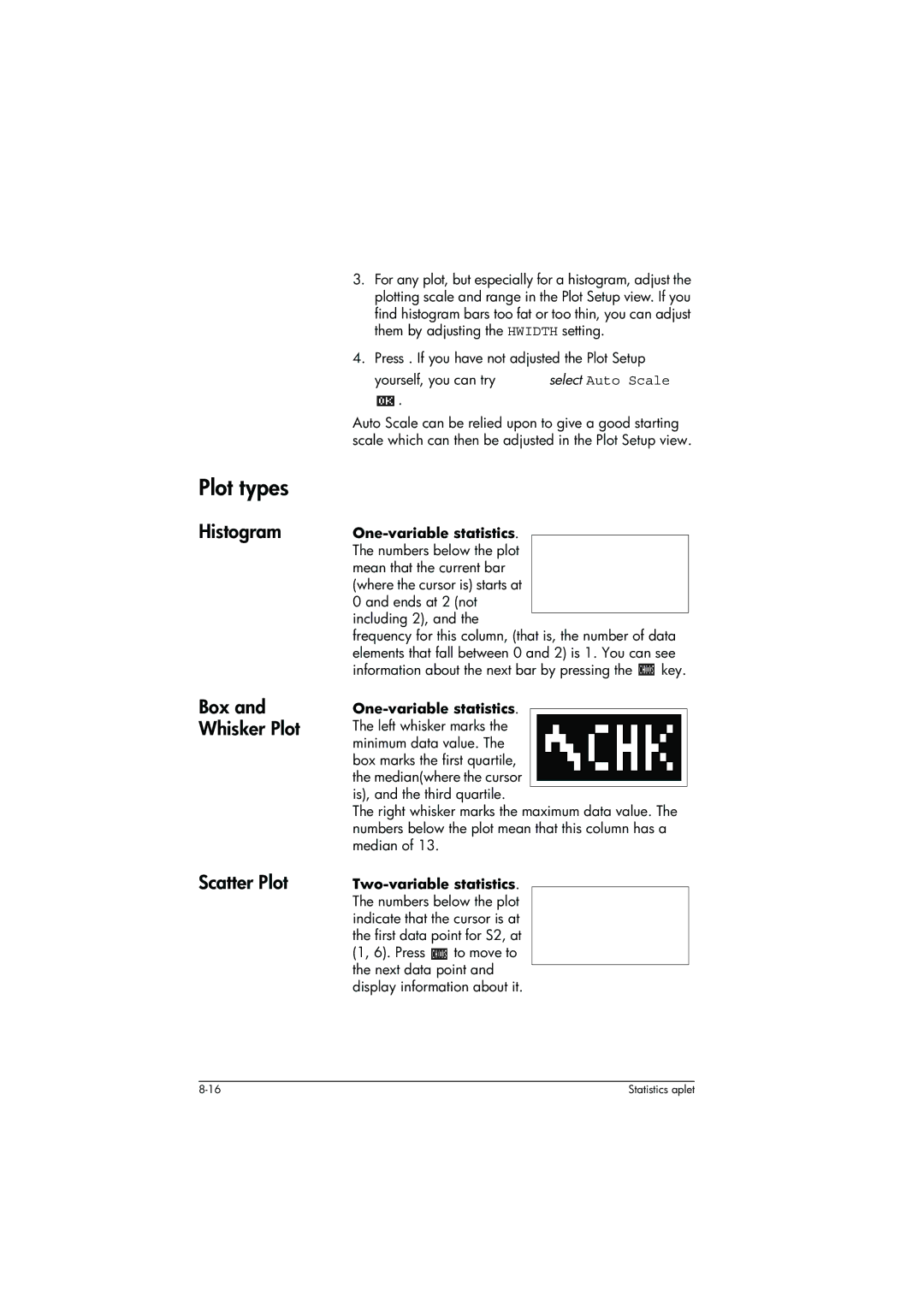
Plot types
Histogram Box and Whisker Plot Scatter Plot
Correlation coefficient
Relative Error
Fitting a curve to 2VAR data
Histogram range Plotting mark 2VAR Connected points 2VAR
Setting up the plot Plot setup view
Trouble-shooting a plot
Statistics aplet’s Plot view keys
Erases the plot
Calculating predicted values
Find predicted values
Statistics aplet
Page
Getting started with the Inference aplet
Inference aplet
About the Inference aplet
Open the Inference aplet
Table below summarizes the options available Symbolic view
Inference aplet’s Symb view keys
Select Hypoth Test
Setup-NUM
Select the inferential method Enter data
Test 1 ∝
Are explained in the feature of this aplet
Importing sample statistics from the Statistics aplet
C1 column, enter the random numbers
If the Decimal Mark setting in the Modes input form
Statistics aplet opens in the Numeric view
Produced by the calculator 529 295 952 259 925 592
Inference
Set up the interval calculation
Open Inference aplet
Select Conf Interval
To move to the C field
Display Numeric view Display Plot view
Specify a 90% Confidence interval in the C field
Menu name
Hypothesis tests
One-Sample Z-Test
Inputs
Two-Sample Z-Test
Results
Test 1π
One-Proportion Z-Test
Population 2 standard
Measures the strength of the evidence for a selected
Two-Proportion Z-Test
One-Sample T-Test
Sample standard deviation
With the α level that you
Two-Sample T-Test
Pooled?
Confidence intervals
One-Sample Z-Interval
Two-Sample Z-Interval
One-Proportion Z-Interval
Two-Proportion Z-Interval
One-Sample T-Interval
Two-Sample T-Interval
Pooled
Critical T Critical value for T
Using the Finance Solver
Background
3 4
Compounding period -- which is
Performing TVM calculations
Example 1 Loan calculations
Soft menu key. The resulting value is PV = $15,705.85
Example 2 Mortgage with balloon payment
Example 3 Amortization for home mortgage
Calculating Amortizations
To calculate amortizations
To continue amortizing the loan
Example 4 Amortization for home mortgage
Math menu
Using mathematical functions
Math functions
Name. Note You do not need to press first
Syntax
Math functions by category
Function categories
Functions common to keyboard and menus
Evalue
Keyboard functions
Value1+ value2 , etc
E5 returns
Returns
LOG100 returns
ABS1,2 returns
∂ s1s1 2+3*s1 returns 2*s1+3
Calculus functions
Nthroot 8 returns
S1,2*X+3,X
ARG
Complex number functions
Taylor
Conj
Constants
Hyperbolic trigonometry
List functions
Loop functions
Polycoef
Matrix functions
Polynomial functions
POLYCOEF2,-3,4,-5 returns1,2,-25
Polyroot
Polyeval
Polyform
Perm
Probability functions
Comb
Random
Real-number functions
HMS→
Fnroot
Frac
→HMS
MOD
MAX
MIN
Change
Sign
Two-variable statistics
Round
Truncate
LINEAR?
Symbolic functions
Isolate
Quad
Test functions
Quote
Trigonometry functions
SEC
Symbolic calculations
Using formal variables
SECvalue
To find derivatives in Home
Symbolic calculations in the Function aplet
Finding derivatives
Select F2X and evaluate it
To find derivatives in the Function aplet’s Symbolic view
Show the result
You could also just define
Thus, substituting X for S1, it can be seen that
To find the indefinite integral using formal variables
For example, to find the indefinite integral
11-24
Variables and memory management
Introduction
Storing and recalling variables
You can use variables in calculations. The calculator
To use variables
Calculations
Substitutes the variable’s value in the calculation
Press
Vars menu
Open the Vars menu
Move the highlight to the variables column
Example
Add the contents of two list variables, and to store
Names or values of variables into programs
Result in another list variable
12-6
Variable on page 15-5 for more
That you can configure using
Real part, and i represents
Information on storing graphic object via
Variable
To access an aplet
X0, Y0 to X9, Y9 Symbolic view. See
Aplet variables on page R-7
Memory Manager
Line, press and press
Page
Matrices
Matrices
Vectors
Matrix Variables
POLYROOT1,0,-1,0XM1
Creating and storing matrices
Matrix Catalog keys
To create a matrix in the Matrix Catalog
Or column you are prompted to Make a choice
Working with matrices
To transmit a matrix
Key Meaning Moves to the first row, last row, first
If M2 is 3,4,5,6, then M21,2 returns
Create the second matrix
Matrix arithmetic
To store one element
Matrices 13-7
Element
Solving systems of linear equations
To negate each
Select Real matrix
Matrix functions and commands
About functions
Cond
Argument conventions
Colnorm
Cross
Eigenval
DET
DOT
Eigenvv
Rref
Rank
Rownorm
Schur
SVL
Examples
SVD
Trace
Reduced-Row Echelon Form
Following set of equations x 2y + 3z = 14 2x + y z =
Lists
You can create, edit, delete, send, and receive named
List catalog keys
Create a list
List edit keys
To display one
Displaying and editing lists
To display a list
To edit a list
Press , and press
A list
To insert an element 1. Open the List catalog
148 L12
Transmitting lists
List functions
Deleting lists
To delete a list
CONCAT1,2,3,4 returns 1,2,3,4
2,3 returns 5,10,15
CONCATlist1,list2
∆LISTlist1
POSlist, element
ΠLISTlist
ΠLIST2,3,4 returns
POS 3, 7, 12, 19,12 returns
Sorts elements in ascending order. SORTlist
Finding statistical values for list elements
ΣLIST2,3,4 returns
List, L1 Create L1 with values 88, 90, 89, 65, 70,
Are now in column 1 C1
Your work is automatically saved. Press any view key
Aplet note view
To write a note in Note view
Or to exit the Notes view
Space key for text entry
Contents of variables
Commands
Alpha-lock for letter entry
To draw a line
Aplet sketch view
Sketch keys
To draw a box
Draw keys
Press to continue drawing, or press
Mynote
For a name
Opens the selected note for
Begins a new note, and asks
Another hp 39g+ or PC
Press instead
Contents of a Program Structured Programming
Programming
Be simple-or it can be divided further into other
Program catalog
Open Program Catalog
Programs that perform smaller tasks
Program catalog keys
Press Progrm to open the Program catalog
Creating and editing programs
Create a new program
Edit a program 1. Press Progrm to
On the left, use or to highlight a command
Press to paste the command into the program editor
Editing keys
Using programs
Run a program Debug a program Stop a program
Transmit a program
Customizing an aplet
Aplet naming convention
Example
Configuring the Setviews menu option programs
Save the aplet
’’My Entry2’’’’EXP.ME2’’3
Setviews ’’’’ ’’’’18
’’My Entry1’’’’EXP.ME1’’1
’’ ’’’’EXP.SV’’0
’’START’’’’EXP.S’’7
Programming commands
’’’’’’EXP.ANG’’0
Select
Aplet commands
Check
Setviews
Associating programs with your aplet
Auto-run programs
Including standard menu options
ProgramName
ViewNumber
Uncheck n
Branch commands
IF...THEN...END
1XA
END CASE...END Iferr Then
Iferr trap-clause Then error-clause END
IF... THEN... Else
END
Stop
Drawing commands
RUN
ARC
Graphic commands
Grobnot
→DISPLAY
→GROB
Grobor
Loop commands
Do a + 1 X a Until a ==
Matrix commands
Editmat
Delcol
Delrow
Randmat
Print commands
Prompt commands
Disptime
Choose
Disp
Disp 3A is 2+2
Input
Input nametitle,labelhelpdefault
Getkey
Editmat matrixname
Prompt
Stat-One and Stat-Two commands
Msgbox
Wait
Stat-One commands
Stat-Two commands
Area
Storing and retrieving variables in programs
Plot-view variables
Axes
FastRes
Coord
Extremum
Grid
InvCross
Hwidth
Indep
Isect
Root
Nmin / Nmax
Recenter
S1mark-S5mark
StatPlot
Simult
Slope
Umin/Umax
Tstep
Tmin / Tmax
Tracing
Xcross
Xmin / Xmax
Xtick
Ytick
Ymin / Ymax
Symbolic-view variables
E1...E9, E0
R1...R9, R0
U1...U9, U0
S1fit...S5fit
Digits
Numeric-view variables
C1...C9, C0
Format
NumIndep
NumCol
NumFont
NumRow
NumZoom
NumStep
NumType
StatMode
Graphicname X
Sketch variables
PageNum
PageNum
Extending aplets
Creating new aplets based on existing aplets
Degrees
Open the Solve aplet and save it under the new name
Solve
Choose the sine formula in E1
Resetting an aplet
Using a customized aplet
Hewlett-Packard’s Calculators web site can be found at
Downloading e-lessons from the web
Sending and receiving aplets
Sorting items in the aplet library menu list
To transmit an aplet
To sort the aplet list To delete an aplet
Expression line#
Reference information
Glossary
Cross matrix1,matrix2
Vector One-dimensional array of values
Editor and catalog Matrix Two-dimensional array of values
Record using the Program editor
Set to Comma and enclosed
To reset using the keyboard
Resetting the hp 39g+
To erase all memory and reset defaults
Split screens
Batteries
Operating details
If the calculator does not turn on
To install the main batteries To install the backup battery
Variables
Home variables
Angle
Function aplet variables
Area Root Extremum Slope Isect
Parametric aplet variables
Parametric aplet variables are Category Available name Plot
Polar aplet variables
Polar aplet variables are Category Available names Plot
Sequence aplet variables
Sequence aplet variables are Category Available name Plot
Digits NumCol Format NumRow
Solve aplet variables
Solve aplet variables are Category Available name Plot
Statistics aplet variables
Math functions are Category Available name Calculus
Math menu categories
Math functions
Hyperb
Category Available name Matrix
Polynom
Program constants
Branch
Program commands
Program commands are Category Command Aplet
Print
Status messages
Current screen
Function value, root, extremum
Or intersection is not visible
Such as 0/0
Limiting Warranty
Hp 39g+ Graphing Calculator Warranty period 12 months
Limiting Warranty
Service
Canada 905 206-4663 or
Rotc = Rest of the country
Regulatory information
USA
Limiting Warranty
Index
Maximum real number 11-8 minimum real number
Freeze 16-20 Line 16-20 Pixoff 16-20 Pixon 16-20 Tline
Grobor
Grobxor
Inverse hyperbolic cosine 11-8 inverse hyperbolic functions
Break
Angle measure 1-10 decimal mark 1-11 number format
Order of precedence 1-21 overlaying plots 2-16,4-3 11-8
Sending and receiving 16-8 structured
Menu lists 1-8 speed searches
Navigate around 3-8 numeric values 3-7 numeric view setup
Index