Menu Elements
Title bar | Tab |
|
|
|
|
|
|
|
|
| Setup |
|
|
|
Highlight |
| Page1 | Page2 | Page3 | Page4 |
| Orientation |
| Desktop Front |
| |
|
|
| |||
|
| Cinema Position | Top |
| |
|
| Background |
| Logo |
|
|
|
|
| Solid triangle |
|
| Slide ber | ||||||||
|
|
|
|
|
|
|
|
|
|
|
|
|
|
|
|
|
|
|
|
|
|
|
|
|
|
|
|
|
|
|
|
Menu |
|
|
|
|
|
| Picture |
|
|
|
|
|
|
| |
Menu mode | Basic |
|
|
|
| Brightness | 0 |
|
|
|
|
|
| ||
|
|
|
|
|
|
|
|
|
| ||||||
|
|
|
|
|
|
|
|
|
|
|
| ||||
|
|
|
| Contrast | 0 |
|
|
|
|
|
| ||||
Language | English |
|
|
|
|
|
|
|
|
|
| ||||
|
|
|
|
|
|
|
|
|
|
|
| ||||
|
|
|
| Color | 0 |
|
|
|
|
|
| ||||
Source Display |
| On | Off |
|
|
|
|
|
|
| |||||
|
| Hue | 0 |
|
|
|
|
|
| ||||||
No Input Display |
|
| On | Off |
|
|
|
|
|
|
| ||||
|
|
| Sharpness | 0 |
|
|
|
|
|
| |||||
|
|
|
|
|
|
|
|
| |||||||
Volume Bar |
|
| On | Off |
|
|
|
|
|
|
|
|
| ||
|
|
|
|
|
|
|
| ||||||||
Keystone Bar |
|
| On | Off |
|
|
|
|
|
|
|
|
| ||
Menu Display Time |
|
|
|
|
|
|
|
|
|
|
|
|
|
|
|
Auto 45 Sec |
|
|
|
|
|
|
|
|
|
|
|
| |||
|
|
|
|
|
|
|
|
|
|
|
|
|
|
|
|
|
|
|
|
|
|
|
|
|
|
|
|
|
|
|
|
Radio button
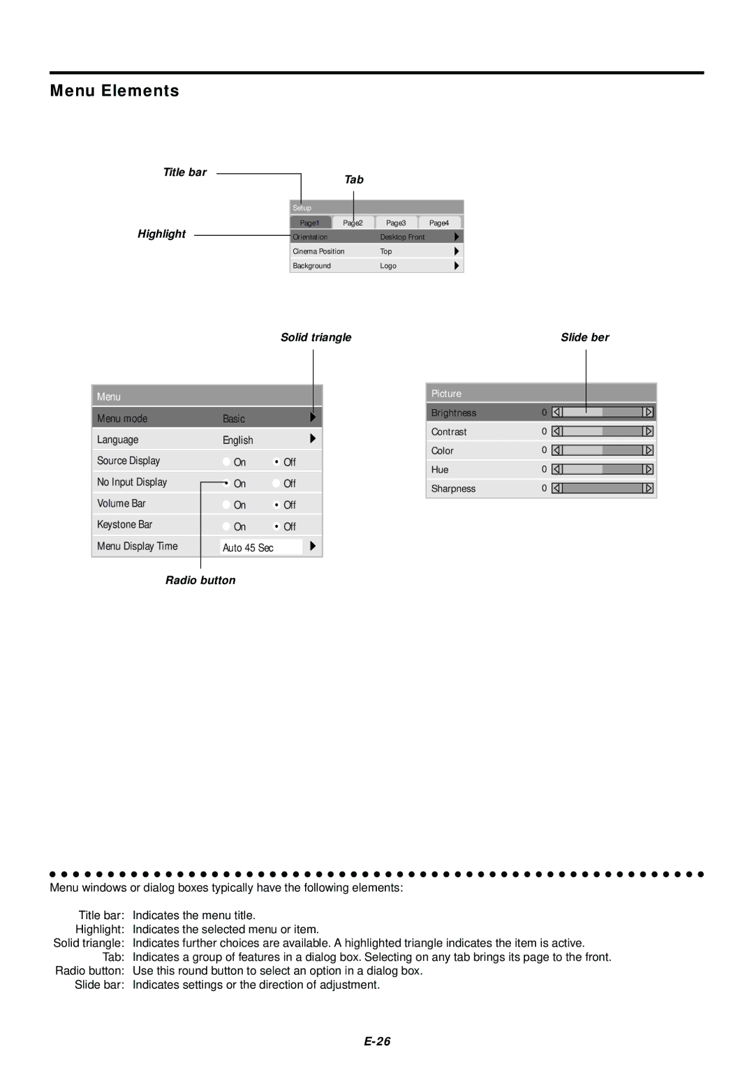
Menu windows or dialog boxes typically have the following elements:
Title bar: | Indicates the menu title. |
Highlight: | Indicates the selected menu or item. |
Solid triangle: | Indicates further choices are available. A highlighted triangle indicates the item is active. |
Tab: | Indicates a group of features in a dialog box. Selecting on any tab brings its page to the front. |
Radio button: | Use this round button to select an option in a dialog box. |
Slide bar: | Indicates settings or the direction of adjustment. |
