Guide to Effective Presentations

Red

Blue

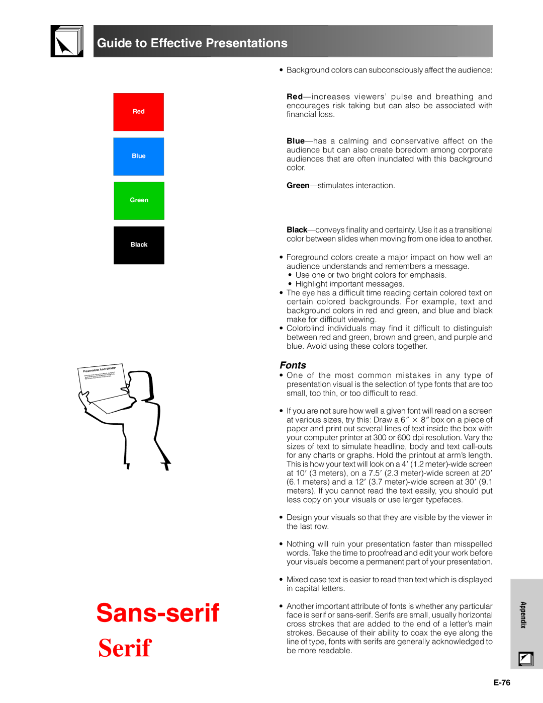
Background colors can subconsciously affect the audience:

Red—increases viewers’ pulse and breathing and encourages risk taking but can also be associated with financial loss.

Blue—has a calming and conservative affect on the audience but can also create boredom among corporate audiences that are often inundated with this background color.

Green—stimulates interaction.

Green

Black


from SHARP

Presentation

e of


es in any typ

One of the

most common mistak n of type fonts


visual is the selectio

to read.

presentation


too thin, or hard


that are too small,


Sans-serif

Serif

Black—conveys finality and certainty. Use it as a transitional color between slides when moving from one idea to another.

Foreground colors create a major impact on how well an audience understands and remembers a message.

Use one or two bright colors for emphasis.

Highlight important messages.

The eye has a difficult time reading certain colored text on certain colored backgrounds. For example, text and background colors in red and green, and blue and black make for difficult viewing.

Colorblind individuals may find it difficult to distinguish between red and green, brown and green, and purple and blue. Avoid using these colors together.

Fonts

One of the most common mistakes in any type of presentation visual is the selection of type fonts that are too small, too thin, or too difficult to read.

If you are not sure how well a given font will read on a screen at various sizes, try this: Draw a 6   8  box on a piece of paper and print out several lines of text inside the box with your computer printer at 300 or 600 dpi resolution. Vary the sizes of text to simulate headline, body and text call-outs for any charts or graphs. Hold the printout at arm’s length. This is how your text will look on a 4 (1.2 meter)-wide screen at 10 (3 meters), on a 7.5 (2.3 meter)-wide screen at 20 (6.1 meters) and a 12 (3.7 meter)-wide screen at 30 (9.1 meters). If you cannot read the text easily, you should put less copy on your visuals or use larger typefaces.

Design your visuals so that they are visible by the viewer in the last row.

Nothing will ruin your presentation faster than misspelled words. Take the time to proofread and edit your work before your visuals become a permanent part of your presentation.

Mixed case text is easier to read than text which is displayed in capital letters.

Another important attribute of fonts is whether any particular face is serif or sans-serif. Serifs are small, usually horizontal cross strokes that are added to the end of a letter’s main strokes. Because of their ability to coax the eye along the line of type, fonts with serifs are generally acknowledged to be more readable.

E-76

Appendix

Page 77
Image 77
Sharp XG-V10XU operation manual Guide to Effective Presentations, Fonts

XG-V10XU specifications

The Sharp XG-V10XU is a high-performance LCD projector designed for professional environments, offering a blend of advanced features and user-friendly technologies that enhance presentations and visual experiences. With a native resolution of XGA (1024x768), the projector provides clear and precise image quality, making it suitable for both business applications and educational purposes.

One of the standout features of the XG-V10XU is its impressive brightness, boasting 2500 ANSI lumens. This allows the projector to perform well in various lighting conditions, ensuring that images and presentations remain visible even in well-lit rooms. Coupled with a high contrast ratio of 400:1, the projector delivers vibrant colors and deep blacks, enhancing overall image depth and clarity.

The XG-V10XU employs advanced image technologies, including a 3LCD system, which works to create rich and accurate color reproduction. This technology minimizes color break-up and ensures that the projector can handle a wide range of media, from detailed graphs to vivid videos, with excellent fidelity. Additionally, the projector features various image modes that allow users to adjust settings to match different content types, such as presentations, video playback, or photo exhibitions.

Versatility is another strong point of the Sharp XG-V10XU. It supports a variety of input sources, including VGA, composite video, S-Video, and HDMI, making it compatible with multiple devices such as laptops, DVD players, and gaming consoles. This flexibility is augmented by its built-in 10-watt speaker, enabling users to present audio alongside visuals without needing external sound equipment.

Portability is also a key characteristic of the XG-V10XU. Weighing in at around 2.8 kg, it is designed for ease of transport, making it an excellent choice for traveling professionals or educators who need to move between locations. The projector’s compact dimensions do not compromise build quality, as Sharp incorporates durable materials to ensure longevity under regular use.

Additionally, the Sharp XG-V10XU includes features such as a digital keystone correction to adjust image distortions, facilitating quick setup in varied environments. With a lengthy lamp life of approximately 4000 hours, maintenance is minimized, allowing users to focus on their presentations rather than equipment downtime. Overall, the Sharp XG-V10XU stands out as a reliable and effective solution for those in need of a quality projector that combines ease of use with exceptional performance.