Americas Headquarters
Text Part Number OL-22617-01
Page
N T E N T S
Span
Network Sites
URL
Nbar
System Administration Resources
Audit Trail
Understanding Traffic Patterns at the Network Layer
About This Guide
Chapter Overview
Audience
Conventions
Convention
Boldface font
Obtaining Documentation and Submitting a Service Request
Xiv
Introducing NAM Traffic Analyzer
A P T E R
Dashboards
Logical Site
New Application Classification Architecture
Standards-Based NBI
NetFlow v9 Data Export
Historical Analysis
Snmp v3 Support -- NAM to Router/Switch Support
Overview of the NAM Platforms
WS-SVC-NAM-1-250S
WS-SVC-NAM-2-250S Cisco Branch Routers
Logging
Navigating the User Interface
Common Navigation and Control Elements
Menu Bar
Detailed Views
Context Menus
Quick Capture
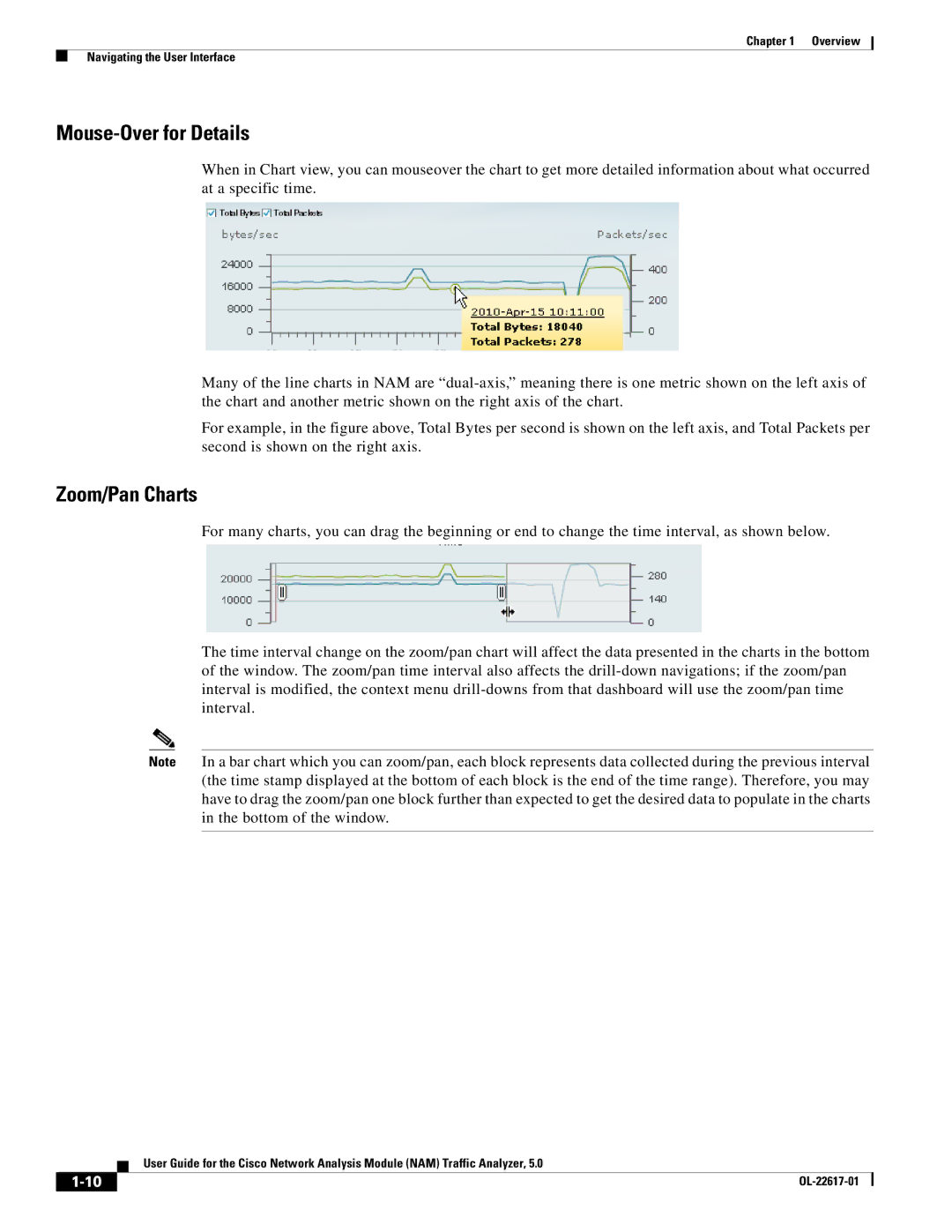
Chart View / Grid View
Interactive Report
Zoom/Pan Charts
Mouse-Over for Details
Sort Grid
Bytes / Packets
Statistics
Understanding How the NAM Works
Context-Sensitive Online Help
Configuration/guide/span.html
Configuration/guide/nde.html
Ports VLANs
Understanding How the NAM Uses Span
Understanding How the NAM Uses VACLs
Module Cisco IOS Software
Guide/span.html
Understanding How the NAM Uses NDE
Guide/vacl.html
Understanding How the NAM Uses Waas
Configuration Overview
Action Description GUI Location User Guide Location
Administration System
Setup Data Export
Setup Network Sites
Setup Alarms Actions
Configuring and Viewing Data
Administration Users
Capture Packet
Capture/Decode
Cisco Waas NAM Virtual Service Blade
Default Functions
Traffic Analysis
Voice Signaling/RTP Stream Monitoring
Application Response Time Metrics
Analyze Media Voice Call Statistics
Traffic
Traffic Usage Statistics
About Span Sessions
SPAN, Data Sources, Hardware Deduplication,
Switch CLI
Method Usage Notes
NAM Traffic Analyzer the NAM GUI
Supervisor portCopyTable Snmp
Column Description
Creating a Span Session
State Description
Field Description
Choose Setup Traffic Span Sessions
Editing a Span Session
Dialog Box
Data Sources
Deleting a Span Session
SPAN, ERSPAN, VACL, NetFlow, WAAS,
Router or switch or WAE device
Or Disabled
Fields are explained in -7, NAM Data Sources
Data Port if it is a local physical port, or the IP address
Enabling Auto-Creation of Erspan Data Sources Using the CLI
Click Setup Traffic NAM Data Sources
Disabling Auto-Creation of Erspan Data Sources Using the CLI
Creating Erspan Data Sources Using the Web GUI
Creating Erspan Data Sources Using the CLI
Deleting Erspan Data Sources Using the Web GUI
Enter the device ID from Step
Enter the name you would like for the data source required
Deleting Erspan Data Sources Using the CLI
Use the no data-sourcecommand to delete the data source
Click the Delete button along the bottom of the window
Configuring Erspan on Devices
Use the no device command to delete the device
Sample Configuration of Erspan Source
Sample Configuration of Erspan Destination
Configuring Vacl on a WAN Interface
Sample Configuration
Configuring Vacl on a LAN Vlan
NetFlow
Understanding NetFlow Interfaces
Understanding NetFlow Flow Records
Configuring NetFlow on Devices
Managing NetFlow Data Sources
Output Interface Are Flows Reported?
For Devices Running Cisco IOS
For NAMs Located in a Device Slot
Enabling Auto-Creation of NetFlow Data Sources Using the CLI
Creating NetFlow Data Sources Using the Web GUI
Snmp Credentials
Creating NetFlow Data Sources Using the CLI
Security Level
Deleting NetFlow Data Sources Using the Web GUI
Deleting NetFlow Data Sources Using the CLI
Testing NetFlow Devices
Understanding Waas
Contact information for the device
Snmp read test result. For the local device only
Setting Description
Configure a Client data source
Point, configure a Client WAN data source
Configure a Server WAN data source
Monitoring Client Data Sources
Monitoring WAN Data Sources
Monitoring Server Data Sources
Server data source
Managing Waas Devices
Deployment Scenarios
Deployment Scenario
Choose Setup Traffic NAM Data Sources
Adding Data Sources for New Waas Device
Editing Waas Data Sources
Deleting a Waas Data Source
Choose Setup Traffic Hardware Deduplication
Hardware Deduplication
Auto Create of New Waas Devices
Alarms
Alarm Actions
Alarm Actions, Thresholds, User Scenario,
Alarm Action Configuration
Editing Alarm Actions
Deleting Alarm Actions
Choose Setup Alarms Actions
Thresholds
Name of the threshold
Application associated with this threshold
Site associated with this threshold
Setting Host Thresholds
Alarm Summary dashboard Monitor Overview Alarm Summary
Choose Setup Alarms Thresholds
Field
Setting Conversation Thresholds
Setting Application Thresholds
Dashboard Monitor Overview Alarm Summary , where you
Setting Response Time Thresholds
Setting Dscp Thresholds
Give the Dscp Alarm Threshold a name
Dashboard Monitor Overview Alarm Summary, where you
Chose a Dscp value from the list
Setting RTP Stream Thresholds
Give the RTP Streams Alarm Threshold a name
High, Low, or High and Low alarms
Alarm actions
Setting Voice Signaling Thresholds
Setting NDE Interface Thresholds
Dashboard Monitor Overview Alarm Summary , where you can
Give the NDE Interface Alarm Threshold a name
Choose a data source from the list
Editing an Alarm Threshold
Deleting a NAM Threshold
Data Export
User Scenario
NetFlow
NetFlow, Scheduled Exports, Custom Export,
Viewing Configured NetFlow Exports
Choose Setup Data Export NetFlow
NetFlow Exports screen appears shown in Figure
Configuring NetFlow Data Export
Description of the NetFlow Export
Port number of the device to be exported to
Valid characters 1-9. Length Min 1, Max
Record types supported by NAM for NetFlow are
Application
Host
ART Client Server Application
Scheduled Exports
Editing NetFlow Data Export
Click
Choose Setup Data Export Scheduled Exports
Editing a Scheduled Export
Deleting a Scheduled Export
Managed Device
Custom Export
Device Information
Choose Setup Managed Device Device Information
Total time the switch has been running
Name of the network administrator for the router
Name of the Snmp read-write community string configured on
Nbar Protocol Discovery
Network
Sites
Field / Operation Description
Sites, NDE Interface Capacity, Dscp Groups,
Specifying a Site Using Subnets
Specifying a Site Using WAE devices Waas Data Sources
Definition Rules
Specifying a Site Using Multiple Rules
Viewing Defined Sites
Resolving Ambiguity Overlapping Site Definitions
Shows if the site is Enabled or Disabled
Defining a Site
Name of the site
Description of what the site includes
See -7for an example
Unique text string for naming a site
Optional text string for describing site
Subnet Detection
Editing a Site
Subnet Detection
Enter an IPv4 or IPv6 address
NDE Interface Capacity
Dscp Groups
Creating an NDE Interface
Choose Setup Network Dscp Groups
Creating a Dscp Group
Field Description Usage Notes
Through Dscp AF/EF/CS Format Bit Field Format
Classification
Editing a Dscp Group
Deleting a Dscp Group
Applications
8shows an example of what the screen may look like
Choose Setup Classification Applications
Creating a New Application
Editing an Application
That list, highlight it and click the left arrow
Repeat through as many times as desired
Choose Setup Classification Application Groups
Application Groups
Deleting a Protocol
Creating an Application Group
URL-based Applications
Editing an Application Group
Deleting an Application Group
To edit an application group
Choose Setup Classification URL-based Applications
Example
Editing a URL-Based Application
Deleting a URL-based Application
Choose Setup Classification Encapsulations
Monitoring
Encapsulations
Aggregation Intervals, Response Time, Voice, RTP Filter,
Choose Setup Monitoring Aggregation Intervals
Aggregation Intervals
URL, Waas Monitored Servers,
Choose Setup Monitoring Response Time
Response Time
Short-Term Long-Term
Normal Minimum
Choose Setup Monitoring Voice
Monitor Setup Window
Voice
Field Appliance
Choose Setup Monitoring RTP Filter
RTP Filter
10,000 500 1,750 000 1,000 250
Enabling a URL Collection Changing a URL Collection
Choose Setup Monitoring URL
Enabling a URL Collection
Disabling a URL Collection
Changing a URL Collection
Element Description Usage Notes
To change a URL collection
URL page -10displays
Choose Setup Monitoring URL Collection
Waas Monitored Servers
Disabling a URL Collection
Adding a Waas Monitored Server
Choose Setup Monitoring Waas Servers
Deleting a Waas Monitored Server
To delete a Waas monitored server data source
Navigation,
Monitor
Analyze
Navigation
Interactive Report
Saving Filter Parameters
Saving Filter Information
Traffic Summary
Response Time Summary
Alarm Summary
Site Summary
Top N Sites by Alarm Count
Top N Hosts by Site and Alarm Count
Top N Applications by Alarm Count
Top N Applications by Site and Alarm Count
Analyzing Traffic
Application
Hosts Detail
Host
Applications Detail
NDE Interface Traffic Analysis
Application group set of applications that can be
Monitored as a whole
Traffic rate number of bytes per second
Viewing Interface Details
Dscp Detail
Dscp value
Application Groups Detail
Applicable site or Unassigned if no site
URL Hits
Viewing Collected URLs
Filtering a URL Collection List
Viewing Collected URLs Filtering a URL Collection List
Host Conversations
Network Conversation
Top Application Traffic
Top Application Traffic
WAN Optimization
Application Traffic By Host
Top Talkers Detail
Application Performance Analysis
Conversation Multi-Segments
Response Time
NAM Application Response Time Measurements
7lists and describes the ART metrics measured by NAM
Metric Description
Metric Description
Application Response Time
Network Response Time
Network
Server Response Time
Client Response Time
Client-Server Response Time
Server Application Responses
Server Application Transactions
Detailed Views Server Application Transactions
Server Network Responses
Client-Server Application Responses
Client-Server Application Transactions
Client-Server Network Responses
Server-response packet, excluding retransmission time
Packet as observed at NAM probing point
Interface,
Interface
Interfaces Stats Table
Health, NBAR,
Switch Health
Health
Interface Statistics Over Time
Chassis Health
Chassis Information
CPU usage
Backplane Utilization
Crossbar Switching Fabric
Ternary Content Addressable Memory Information
Router Health
Router Health
Router Information
Information on how to contact this person
Current state of the power supply being instrumented
Media
Time in hundredths of a second since the network management
RTP Streams
Purpose
RTP Stream Information
RTP Stream Stats Summary
Voice Call Statistics
Monitoring RTP Streams
RTP Stream Stats Details
Calling number as it appears in the signaling protocol
Called number as it appears in the signaling protocol
Calls Table
From inspecting the call signaling protocol
Inspecting call signaling protocol
Time when the call was detected to start
Time when the call was detected to end
RTP Conversation
Field Purpose
Synchronization source number as it appear in the RTP
Header
NAM calculated score that takes into account
Duration of the stream
OL-22617-01
Capturing and Decoding Packet Data
Quick Capture
Sessions
Viewing Capture Sessions
Name of the capture session
Many times as necessary
Size of the session
Configuring Capture Sessions
Operation Description
Choose Capture Packet/Capture Decode Sessions
Configure Capture Session Window
Name of the capture Enter a capture name
Administration System Capture Data Storage
Maximum Capture Session Sizes for NAM Platforms
Maximum Session NAM Platform Size
Software Filters
Maximum Session
NAM Platform Size
300 MB
Creating a Software Filter
Choose Capture Packet Capture/Decode Sessions
Software Filter Dialog -4 displays
IPv4 address in dotted-quad format n.n.n.n, where n is 0 to
Default if blank is
For MAC address, enter hh hh hh hh hh hh, where hh is a
Hexadecimal number from 0 to 9 or a to f. The default is
Choose GTP.IPv6 for IPV6 address for tunneled packet over
Editing a Software Capture Filter
To edit software capture filters
Configuring a Hardware Filter
To cancel the changes, click Cancel
Hardware Assisted Filters
Vlan and IP IP and TCP/UDP IP and Payload Data
Vlan and IP
List is also shown in Figure
IP and TCP/UDP
IP and Payload Data
Files
Payload Data
Display the packets in a file
Delete files
Error Scan
Analyzing Capture Files
Displays a graphic image of network traffic KB/second
Displays packets and bytes transferred for each protocol
Downloading Capture Files
Choose Capture Packet Capture/Decode Files
Deleting a Capture File
Deleting Multiple Files
Viewing Packet Decode Information
Stop packet loading
Load and decode the previous block of packets from the NAM
Load and decode the next block of packets from the NAM
Choose a Filter Mode
Browsing Packets in the Packet Decoder
Filtering Packets Displayed in the Packet Decoder
Choose an Address Filter
Viewing Detailed Protocol Decode Information
Define a Protocol Filter
Using Alarm-Triggered Captures
Custom Display Filters
Creating Custom Display Filters
To create custom display filters
Custom Decode Filter Dialog Box
Tips for Creating Custom Decode Filter Expressions
See Tips for Creating Custom Decode Filter Expressions
Operator Meaning
Format
Editing Custom Display Filters
Field Filter By Format
Examples of Custom Decode Filter Expressions
Choose Capture Packet Capture/Decode Display Filters
Deleting Custom Display Filters
To delete custom display filters
OL-22617-01
User and System Administration
System Administration
Choose Administration System Network Parameters
Resources
Network Parameters
Snmp Agent
Choose Administration System Snmp Agent
Working with NAM Community Strings
Creating NAM Community Strings
Snmp Agent Dialog Box displays
Testing the Router Community Strings
System Time
Deleting NAM Community Strings
To delete the NAM community strings
Synchronizing the NAM System Time with the Switch or Router
Choose Administration System System Time
Synchronizing the NAM System Time Locally
Clock set hhmmss mm/dd/yyyy
Mail Setting
Configuring the NAM System Time with an NTP Server
Choose Administration System E-Mail Setting
To enable Web Data Publishing
Choose Administration System Web Data Publication
Web Data Publication
Capture Data Storage
Configuring the NFS Server
Configuring the NFS Storage Location on the NAM
Creating NFS Storage Locations
Editing NFS Storage Locations
ISCSI target name configured on the remote iSCSI server
Creating iSCSI Storage Locations
Editing iSCSI Storage Locations
Name of the remote storage entry
Syslog Setting
Snmp Trap Setting
Choose Administration System Syslog Setting
Choose Administration System Snmp Trap Setting
Preferences
Editing a NAM Trap Destination
Deleting a NAM Trap Destination
Diagnostics
System Alerts
Audit Trail
System Alerts, Audit Trail, Tech Support,
Choose Administration Diagnostics Audit Trail
Choose Administration Diagnostics Tech Support
Tech Support
Downloading Core Files
User Administration
Recovering Passwords
Privilege Access Level
Local Database
Choose Administration Users Local Database
Creating a New User
To create a new user
Choose the Administration Users Local Database
Editing a User
Deleting a User
Establishing TACACS+ Authentication and Authorization
Field Usage Notes
Configuring a Cisco ACS TACACS+ Server
Click Network Configuration Click Add Entry
For Windows NT and 2000 Systems
Click Submit/Restart
Configuring a Generic TACACS+ Server
Adding a NAM User or User Group
Current User Sessions
Parameter Enter
NAM Traffic Analyzer 5.0 Usage Scenarios
Deployment
Deploying NAMs in the Branch
Deploying NAMs for Voice/Video applications
Deploying NAMs for WAN Optimization
Autodiscovery Capabilities of NAM
Creating Custom Applications
Integrating NAM with Third Party Reporting Tools
Integrating NAM with LMS
Understanding Traffic Patterns at the Network Layer
See Dscp Groups,
See Application Response Time, See Thresholds,
Troubleshooting
Using NAM for Problem Isolation
Using NAM for SmartGrid Visibility
Troubleshooting
General NAM Issues
Error Messages
Does the session from the switch/router work?
Packet Drops
NAM Not Responding
Waas Troubleshooting
NAM Behavior
OL-19530-02
Supported MIBs
Module Object Identifier OID and Description Source
Mib-21.rmon16.tokenRing10.ringStationConfig RFC
Objects10 Power, Temperature and Fan Status
Mib-21.rmon16.tokenRing10.ringStation RFC
Mib-21.rmon16.tokenRing10.ringStation RFC OrderTable3
Cisco9.workgroup5.ciscoStackMIB1.ciscoStatck
CiscoMgmt9.ciscoCat6kCrossbarMIB217.cisco
Cat6kXbarMIBObjects1
Crossbar statistics
OL-22617-01
Capture settings, configuring
Downloading to a file
Custom display filters
Creating
Configuring as datasource
IN-2
Alarm thresholds
Ipesp IPIP4
Creating Deleting Editing Spanning, directing traffic for
IN-4
Authentication and authorization, establishing
Server, configuring to support NAM
Voice data Collecting Viewing Voice signaling thresholds
See Virtual Switch Software Waas data sources