First Steps with
Tutorial 7: One- and
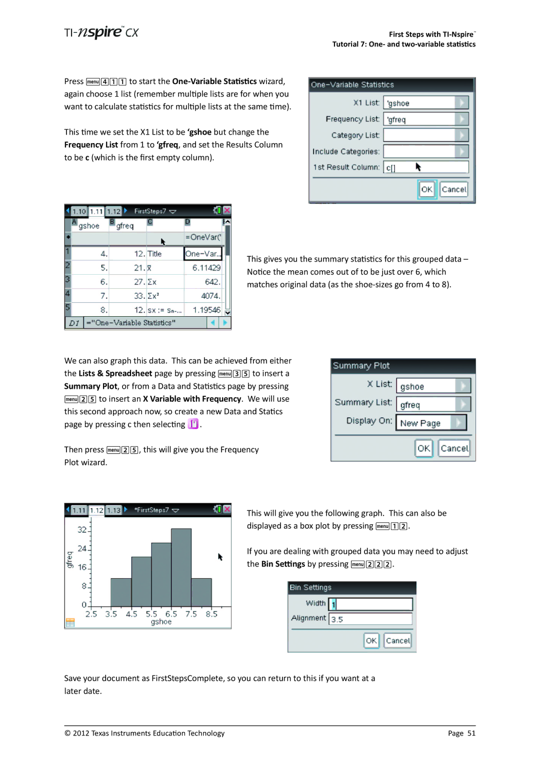
Press b411 to start the
This time we set the X1 List to be ‘gshoe but change the Frequency List from 1 to ‘gfreq, and set the Results Column to be c (which is the first empty column).
This gives you the summary statistics for this grouped data – Notice the mean comes out of to be just over 6, which matches original data (as the
We can also graph this data. This can be achieved from either the Lists & Spreadsheet page by pressing b35 to insert a Summary Plot, or from a Data and Statistics page by pressing b25 to insert an X Variable with Frequency. We will use this second approach now, so create a new Data and Statics page by pressing c then selecting ![]() .
.
Then press b25, this will give you the Frequency
Plot wizard.
This will give you the following graph. This can also be displayed as a box plot by pressing b12.
If you are dealing with grouped data you may need to adjust the Bin Settings by pressing b222.
Save your document as FirstStepsComplete, so you can return to this if you want at a later date.
© 2012 Texas Instruments Education Technology | Page 51 |