It is also possible to arrange
Dragging on the Charts
An interesting feature is the ability to drag plotted points around charts, thus changing the original data. Go back to the page on which you created the scatterplot for male hand spans and shoe sizes. You left the plot showing the y=mx+b regression line and equation.
First Steps with
Tutorial 7: One- and
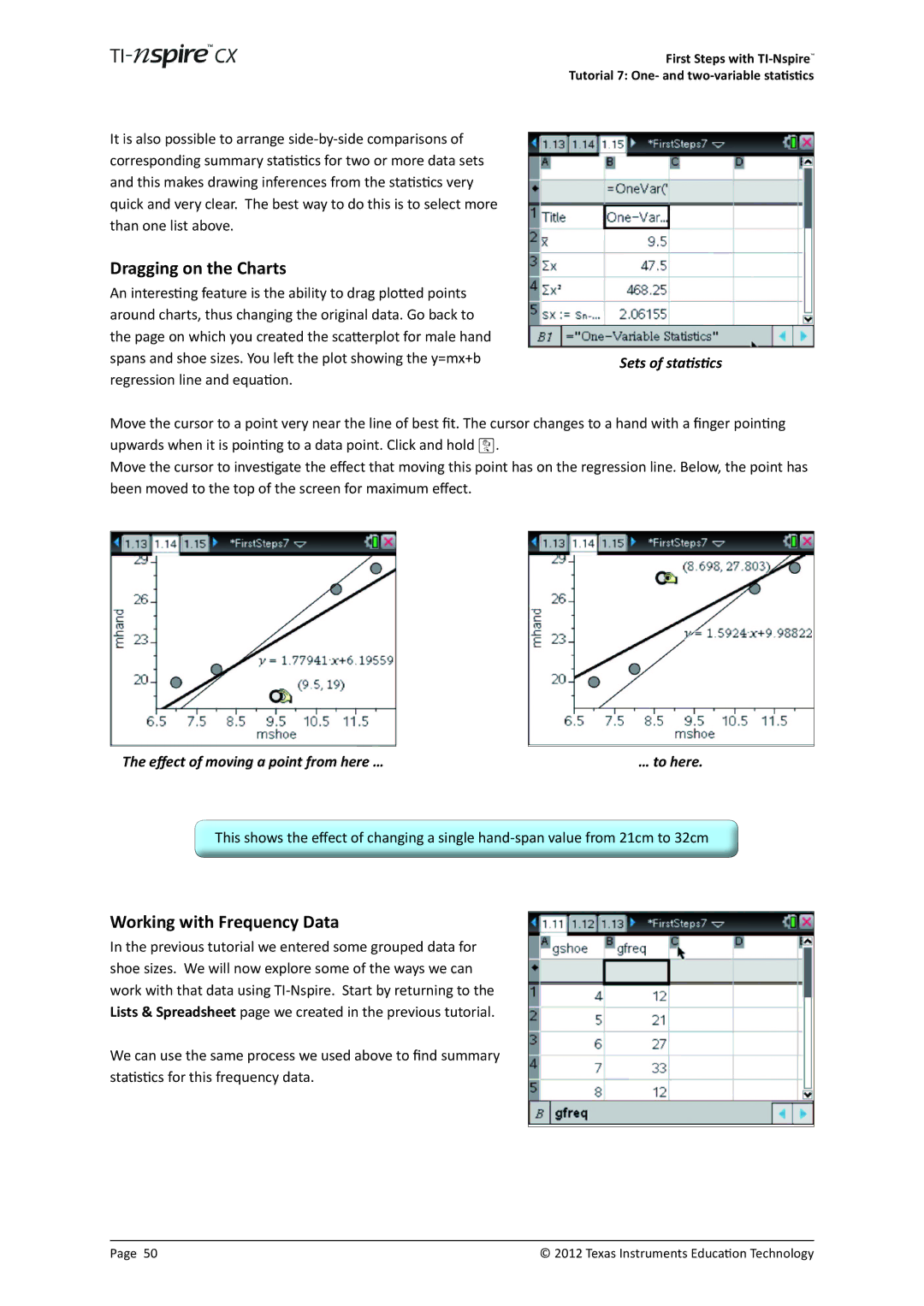
Sets of statistics
Move the cursor to a point very near the line of best fit. The cursor changes to a hand with a finger pointing upwards when it is pointing to a data point. Click and hold x.
Move the cursor to investigate the effect that moving this point has on the regression line. Below, the point has been moved to the top of the screen for maximum effect.
The effect of moving a point from here … | … to here. |
This shows the effect of changing a single
Working with Frequency Data
In the previous tutorial we entered some grouped data for shoe sizes. We will now explore some of the ways we can work with that data using
We can use the same process we used above to find summary statistics for this frequency data.
Page 50 | © 2012 Texas Instruments Education Technology |
