Monitoring Network Traffic
Who Are the Top 5 Talkers?
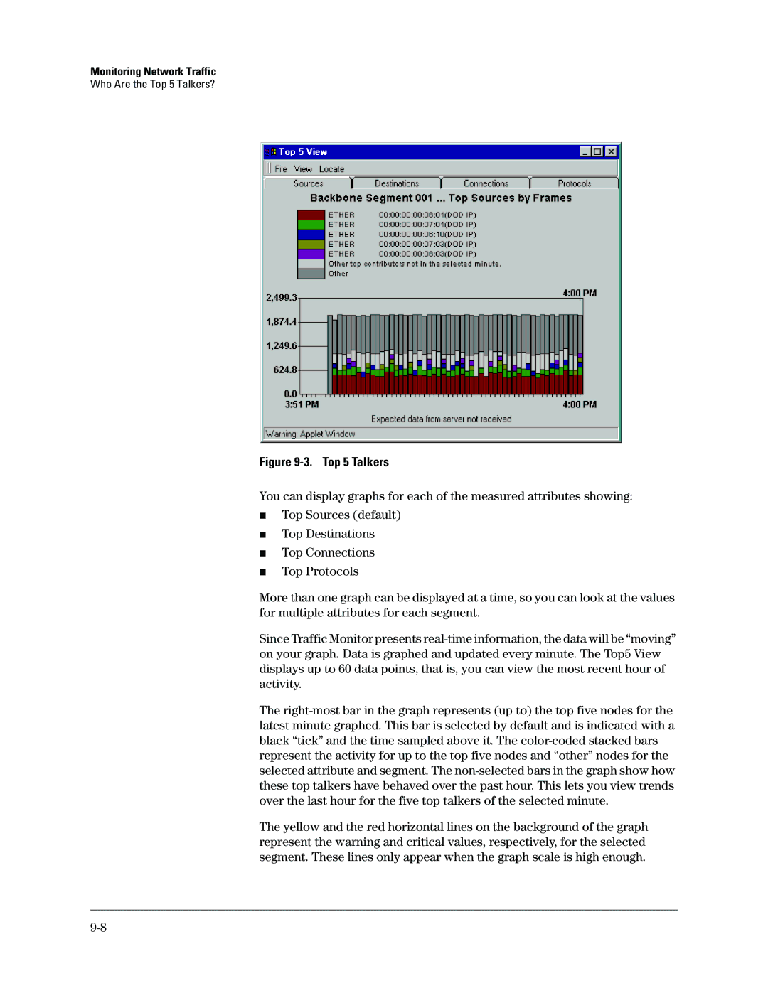
Figure 9-3. Top 5 Talkers
You can display graphs for each of the measured attributes showing:
■Top Sources (default)
■Top Destinations
■Top Connections
■Top Protocols
More than one graph can be displayed at a time, so you can look at the values for multiple attributes for each segment.
Since Traffic Monitor presents
The
The yellow and the red horizontal lines on the background of the graph represent the warning and critical values, respectively, for the selected segment. These lines only appear when the graph scale is high enough.