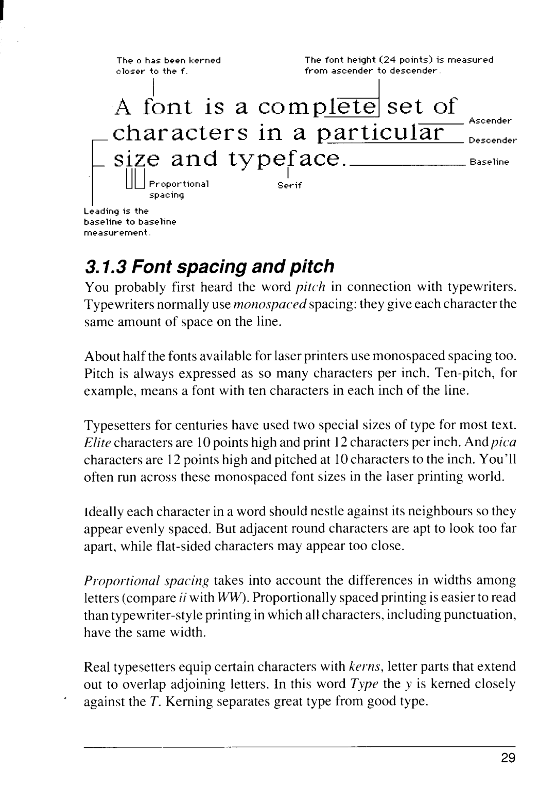
The o has been kerned | The font height | (24 points) is measured |
closer to the f. | from ascender | to descender. |
size and type~ace.
Baseline
t
Ill | Proportional | Serif |
| spacing |
|
L;ading is the baseline to baseline measurement.
3.1.3 Font spacing and pitch
You probably first heard the word pitch in connection with typewriters. Typewriters normally use monospaced spacing: they give each character the same amount of space on the line.
About half the fonts available for laser printers use monospaced spacing too. Pitch is always expressed as so many characters per inch.
Typesetters for centuries have used two special sizes of type for most text. Elite characters are 10points high and print 12characters per inch. And pica characters are 12points high and pitched at 10characters to the inch. You’ll often run across these monospaced font sizes in the laser printing world.
ideally each character in a word should nestle against its neighbors so they appear evenly spaced. But adjacent round characters are apt to look too far apart, while
Proportional spacincqtakes into account the differences in widths among letters (compare ii with w. Proportionally spaced printing is easier to read than
Real typesetters equip certain characters with kerns, letter parts that extend out to overlap adjoining letters. In this word TJ!PCJthe J is kerned closely against the T. Kerning separates great type from good type.
29
