Using the Analyzer
To Monitor the Link (Network)
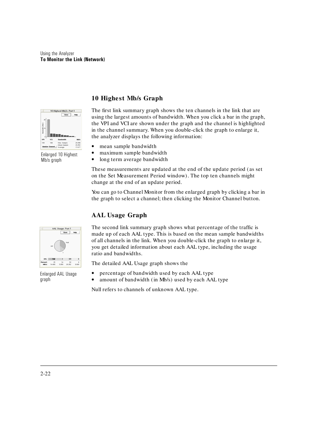
Enlarged 10 Highest Mb/s graph
Enlarged AAL Usage graph
10 Highest Mb/s Graph
The first link summary graph shows the ten channels in the link that are using the largest amounts of bandwidth. When you click a bar in the graph, the VPI and VCI are shown under the graph and the channel is highlighted in the channel summary. When you
∙mean sample bandwidth
∙maximum sample bandwidth
∙long term average bandwidth
These measurements are updated at the end of the update period (as set on the Set Measurement Period window). The top ten channels might change at the end of an update period.
You can go to Channel Monitor from the enlarged graph by clicking a bar in the graph to select a channel; then clicking the Monitor Channel button.
AAL Usage Graph
The second link summary graph shows what percentage of the traffic is made up of each AAL type. This is based on the mean sample bandwidths of all channels in the link. When you
The detailed AAL Usage graph shows the
∙percentage of bandwidth used by each AAL type
∙amount of bandwidth (in Mb/s) used by each AAL type
Null refers to channels of unknown AAL type.