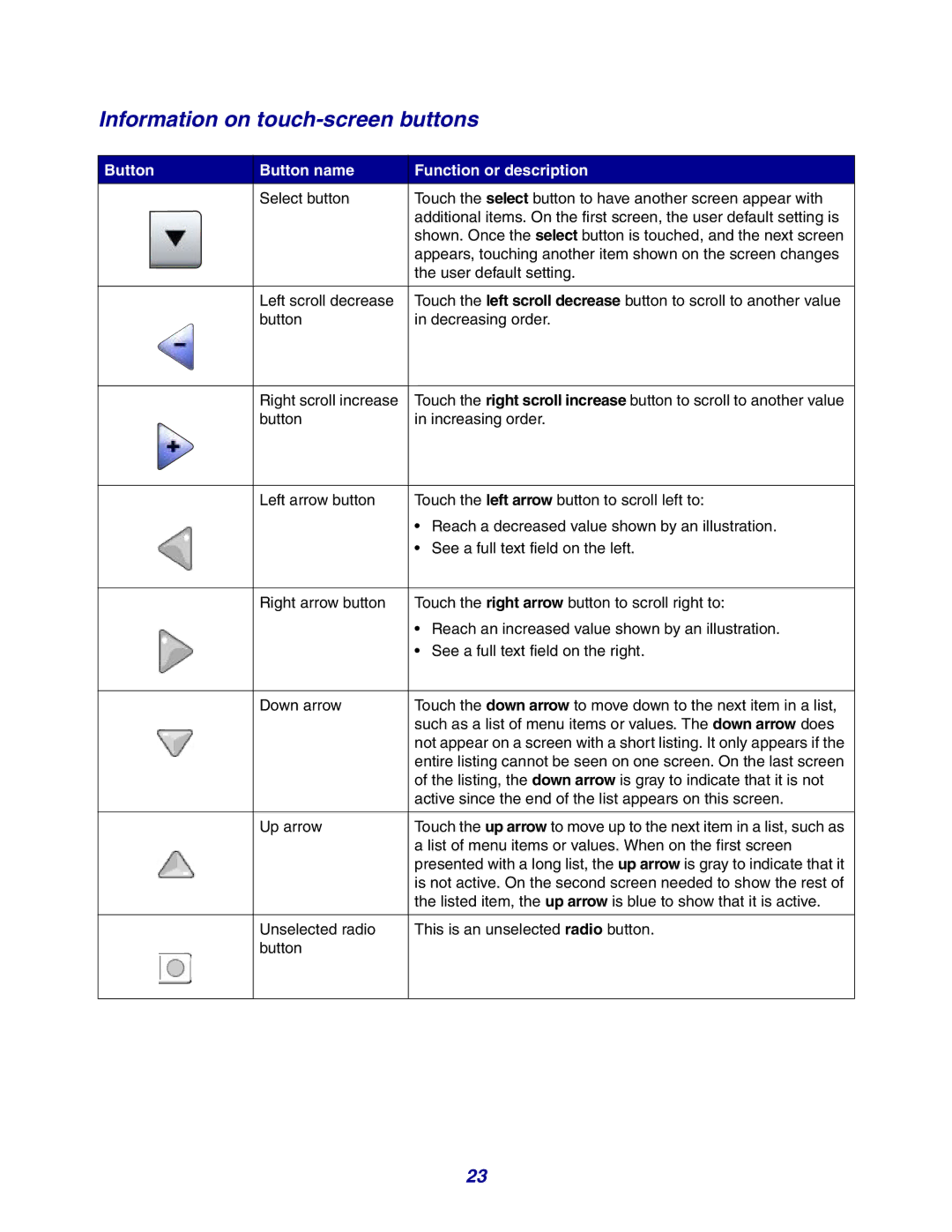
Information on touch-screen buttons
Button | Button name | Function or description |
| Select button | Touch the select button to have another screen appear with |
|
| additional items. On the first screen, the user default setting is |
|
| shown. Once the select button is touched, and the next screen |
|
| appears, touching another item shown on the screen changes |
|
| the user default setting. |
|
|
|
| Left scroll decrease | Touch the left scroll decrease button to scroll to another value |
| button | in decreasing order. |
Right scroll increase | Touch the right scroll increase button to scroll to another value |
button | in increasing order. |
Left arrow button | Touch the left arrow button to scroll left to: |
| • Reach a decreased value shown by an illustration. |
| • See a full text field on the left. |
|
|
Right arrow button | Touch the right arrow button to scroll right to: |
| • Reach an increased value shown by an illustration. |
| • See a full text field on the right. |
|
|
Down arrow | Touch the down arrow to move down to the next item in a list, |
| such as a list of menu items or values. The down arrow does |
| not appear on a screen with a short listing. It only appears if the |
| entire listing cannot be seen on one screen. On the last screen |
| of the listing, the down arrow is gray to indicate that it is not |
| active since the end of the list appears on this screen. |
|
|
Up arrow | Touch the up arrow to move up to the next item in a list, such as |
| a list of menu items or values. When on the first screen |
| presented with a long list, the up arrow is gray to indicate that it |
| is not active. On the second screen needed to show the rest of |
| the listed item, the up arrow is blue to show that it is active. |
|
|
Unselected radio | This is an unselected radio button. |
button |
|
23