17.1 Active hosts and connected users
Histogram
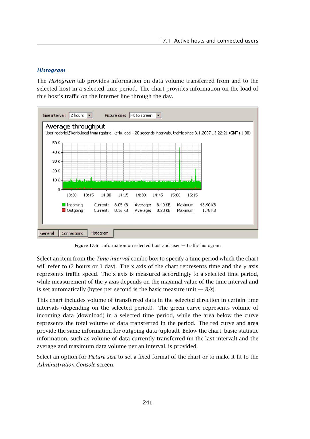
The Histogram tab provides information on data volume transferred from and to the selected host in a selected time period. The chart provides information on the load of this host’s traffic on the Internet line through the day.
Figure 17.6 Information on selected host and user — traffic histogram
Select an item from the Time interval combo box to specify a time period which the chart will refer to (2 hours or 1 day). The x axis of the chart represents time and the y axis represents traffic speed. The x axis is measured accordingly to a selected time period, while measurement of the y axis depends on the maximal value of the time interval and is set automatically (bytes per second is the basic measure unit — B/s).
This chart includes volume of transferred data in the selected direction in certain time intervals (depending on the selected period). The green curve represents volume of incoming data (download) in a selected time period, while the area below the curve represents the total volume of data transferred in the period. The red curve and area provide the same information for outgoing data (upload). Below the chart, basic statistic information, such as volume of data currently transferred (in the last interval) and the average and maximum data volume per an interval, is provided.
Select an option for Picture size to set a fixed format of the chart or to make it fit to the
Administration Console screen.
