| CHART MANAGER UTILITY | |
| Table | |
|
|
|
Tab Title | Description |
|
|
|
|
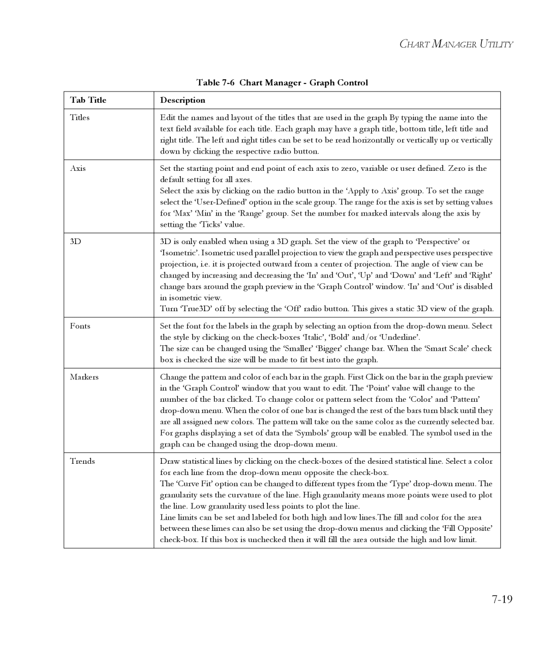
Titles | Edit the names and layout of the titles that are used in the graph By typing the name into the |
|
| text field available for each title. Each graph may have a graph title, bottom title, left title and |
|
| right title. The left and right titles can be set to be read horizontally or vertically up or vertically |
|
| down by clicking the respective radio button. |
|
|
|
|
Axis | Set the starting point and end point of each axis to zero, variable or user defined. Zero is the |
|
| default setting for all axes. |
|
| Select the axis by clicking on the radio button in the ‘Apply to Axis’ group. To set the range |
|
| select the |
|
| for ‘Max’ ‘Min’ in the ‘Range’ group. Set the number for marked intervals along the axis by |
|
| setting the ‘Ticks’ value. |
|
|
|
|
3D | 3D is only enabled when using a 3D graph. Set the view of the graph to ‘Perspective’ or |
|
| ‘Isometric’. Isometric used parallel projection to view the graph and perspective uses perspective |
|
| projection, i.e. it is projected outward from a center of projection. The angle of view can be |
|
| changed by increasing and decreasing the ‘In’ and ‘Out’, ‘Up’ and ‘Down’ and ‘Left’ and ‘Right’ |
|
| change bars around the graph preview in the ‘Graph Control’ window. ‘In’ and ‘Out’ is disabled |
|
| in isometric view. |
|
| Turn ‘True3D’ off by selecting the ‘Off’ radio button. This gives a static 3D view of the graph. |
|
|
|
|
Fonts | Set the font for the labels in the graph by selecting an option from the |
|
| the style by clicking on the |
|
| The size can be changed using the ‘Smaller’ ‘Bigger’ change bar. When the ‘Smart Scale’ check |
|
| box is checked the size will be made to fit best into the graph. |
|
|
|
|
Markers | Change the pattern and color of each bar in the graph. First Click on the bar in the graph preview |
|
| in the ‘Graph Control’ window that you want to edit. The ‘Point’ value will change to the |
|
| number of the bar clicked. To change color or pattern select from the ‘Color’ and ‘Pattern’ |
|
|
| |
| are all assigned new colors. The pattern will take on the same color as the currently selected bar. |
|
| For graphs displaying a set of data the ‘Symbols’ group will be enabled. The symbol used in the |
|
| graph can be changed using the |
|
|
|
|
Trends | Draw statistical lines by clicking on the |
|
| for each line from the |
|
| The ‘Curve Fit’ option can be changed to different types from the ‘Type’ |
|
| granularity sets the curvature of the line. High granularity means more points were used to plot |
|
| the line. Low granularity used less points to plot the line. |
|
| Line limits can be set and labeled for both high and low lines.The fill and color for the area |
|
| between these limes can also be set using the |
|
|
| |
|
|
|
Page 103
Image 103
