COLLECTING DATA WITH LOG MANAGER
| Table |
|
|
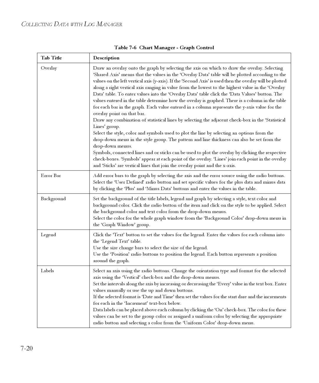
Tab Title | Description |
|
|
Overlay | Draw an overlay onto the graph by selecting the axis on which to draw the overlay. Selecting |
| ‘Shared Axis’ means that the values in the ‘Overlay Data’ table will be plotted according to the |
| values on the left vertical axis |
| along a right vertical axis ranging in value from the lowest to the highest value in the ‘Overlay |
| Data’ table. To enter values into the ‘Overlay Data’ table click the ‘Data Values’ button. The |
| values entered in the table determine how the overlay is graphed. There is a column in the table |
| for each bar in the graph. Each value entered in a column represents the |
| overlay point on that bar. |
| Draw any combination of statistical lines by selecting the adjacent |
| Lines’ group. |
| Select the style, color and symbols used to plot the line by selecting an options from the |
| |
| |
| Symbols, connected lines and or sticks can be used to plot the overlay by clicking the respective |
| |
| and ‘Sticks’ are vertical lines that join the overlay point and the |
|
|
Error Bar | Add error bars to the graph by selecting the axis and the error source using the radio buttons. |
| Select the ‘User Defined’ radio button and set specific values for the plus data and minus data |
| by clicking the ‘Plus’ and ‘Minus Data’ buttons and enter the values in the table. |
|
|
Background | Set the background of the title labels, legend and graph by selecting a style, text color and |
| background color. Click the radio button of the item and click on the style to be applied. Select |
| the background color and text color from the |
| Select the color for the whole graph window from the ‘Background Color’ |
| the ‘Graph Window’ group. |
|
|
Legend | Click the ‘Text’ button to set the values for the legend. Enter the values for each column into |
| the ‘Legend Text’ table. |
| Use the size change bars to select the size of the legend. |
| Use the ‘Position’ radio buttons to position the legend. Each button represents a position |
| around the graph. |
|
|
Labels | Select an axis using the radio buttons. Change the orientation type and format for the selected |
| axis using the ‘Vertical’ |
| Set the intervals along the axis by increasing or decreasing the ‘Every’ value in the text box. Enter |
| values manually or use the up and down buttons. |
| If the selected format is ‘Date and Time’ then set the values for the start dare and the increments |
| for each in the ‘Increment’ |
| Data labels can be placed above each column by clicking the ‘On’ |
| values can be set to the group color or assigned a uniform color by selecting the appropriate |
| radio button and selecting a color from the ‘Uniform Color’ |
|
|