Part Number M1046-9220L Printed 02/2003
PHI
Warranty
Iii
Electromagnetic Compatibility M1205A Only
Electromagnetic Interference
Avoiding Electromagnetic Interference
Environment
Intended Use
Description
Purpose
Physiological Purpose
Indications for Use
Condition
Frequency of Use
Prescription Versus Over-the-Counter
Viii
Indications for Use
Monitor Setup Monitor Revision → Show SW Rev
Manufacturer´s Address
Responsibility of the Manufacturer
Responsibility of the Manufacturer Xii
Contents
CMS and V24 and V26 Patient Monitors
Getting Started
Contents-4
Other Patients
Contents-6
Admit/Discharge/End Case
Neonatal Event Review
Battery Information V24CT and V26CT only 12-1
Contents-10
CMS and V24 and V26 Patient Monitors
System
Introduction
CMS Patient
Monitoring
M1167/77A System
M1167/77A System with External Alarm Device
Full Title Abbreviation
M1165/75A and M1166/76A System
CMS and V24 and V26 Patient Monitors
V24 Patient Monitor
Hardkeys
Control
Panel
Softkeys
Key instead
CMS Control Panel
V24 and V26 Patient Monitor Control Panel
Keys
Handheld Keypad
CMS only
Normal
External Alarm Device
Until
Functions
Hardkey
Confirm Key
Supply
V26CT/V24CT Power Supply
Battery
Power
Volt
Battery
Specifications
Parameter Modules
Symbol Name Function Which Modules?
Symbols to Indicate Key Functions
Rack can be used
Rack Type Mounting Comments
CMS Patient Monitoring System
V24 and V26 Patient Monitor
Is displayed if an unknown module is plugged into the rack
Message
Operating Levels
CMS and V24 and V26 Patient Monitors
135/72
Function
For information on how to change the selection see
Selection
Window
Via the Selection Window
By pressing the Setup key on the parameter module
Task
There are two ways to get into the second operating level
Task Window
Getting into the Operating Levels
Below to get into the Selection and Task Windows
Selection Window
CMS and V24 and V26 Patient Monitors
Touch or Mouse/Trackball Operation
Control Panel Task Window
Trackball
General
Touch
Mouse
Touch Responsive Objects
From
Items Task Window the Touchboard was accessed from Press
Disabling
Module
CMS Computer Modules
M1046A
Computer
ECG Output and Defibrillator Marker Input
M1046B
V24 and V26 Parameter Module Rack
Operating Rules to Remember
Performance Specifications of the Philips Displays
Performance Requirements
Using an ITE Display
Safety
Safety
Require
Specification Requirement or Value Units
Perfor
Mance
Using an ITE Display CMS and V24 and V26 Patient Monitors
Getting Started
Setting up the Monitor V24 and V26 only
Inserted. StartedGetting
Getting Started
Setting up the Parameter Modules
Attaching the Patient
V24
Adjusting
Screen
Contrast
Messages
Starting Monitoring
Task Window the prompt and status messages remain until
Below the alarm and Inop messages
Reserving a Channel
Prompt messages appear for 3 seconds
Standby
Failure
Information
Center
Getting Started
Getting Started
Setting up your Monitor
Changing Display Screens
CMS or
Procedure
Selecting a Screen
Press the hardkey
Other key except To restart the waves
Freezing Waves CMS only
You can freeze any wave movement on the screen via
Keys. Press
What you Can Configure
Hardkeys are indicated in the text like this
Changes to the Configuration
Making Changes to the Main Display
Assigning Waves to Screen Channels
To place in your selected channel
Press Repeatedly to select a channel on
Screen
Press To move the selection to the wave you want
Task Window. The other items on the screen will change
Depending on the configuration of the different screens
Press To select a screen A-E. The selected
Screen choice and its screen label will appear at the top
Selecting Screen Labels for Realtime Display Screens
Press Confirm
Depending on your model
Selecting the Number of Waves
Screen Press To choose 4, 6, or 8 waves to be displayed
Indicate which waves are overlapping
Changing the Wave Overlap
Press To choose one of the available numbers
Dependent on model. The boxes in the middle of the screen
Selecting Realtime Wave Speeds
Selection window or
To return to the Realtime
To return to
On/Off
Numerics
Numeric Positions
Aligned Numerics
Numeric Sizes
Additional
Application window to be displayed
Selecting an Application Window
They are described in more detail in the following sections
Press Until ApplicWindow is selected on
Special Implications for Touch or Mouse Operation
Displaying Split Screen Trends
Systolic pressure
Viewing Trend
Data for
Invasive Blood
Below
With a thicker line than the other trends
Data for Non
Main Screen Display with oxyCRG
OxyCRG Display
Standard Display OxyCRG Display
OxyCRG
Main Screen
Monitor
CSA Display CMS only
Realtime waves
Main Screen Standard Display CSA Display
Will be filled with another wave
Wave Replace
Press Until Wave Replace is selected on
Press To choose fixed or moving traces
Trace Mode
Configuring a Second Independent Display CMS only
Parameters On/Off
Other Functions You Can Configure
Switch this setup off again using On/Off Setup or
→ On/Off Setup
Adjusting the Volume Control
135/72
Corresponding softkeys
Adjusting the Date and Time
Message will appear with the date and time settings
Monitor
Selecting Waves for Central Recorders
Configuring Module, Bedside and Central Recordings
Other Patients Controls
Status Log Function
Monitor Revision Function
Changing Default Settings and Patient Category
Changing the Patient Category
Adult Neo Inv. Pressure
Parameter Patient Category Adult Pedi Neo
Adult Pedi Neo
Adult Neo
Neonate
Examples
Adult
Pediatric
Setting up your Monitor
ECG
NBP Recommendations
Morphology
Recommendations
Recommendation
Adult bpm Pedi/Neo bpm
Heart Rate HR / Pulse
Pressure
SpO2
Adult/Pedi Neo
CO2
Type, as this is automatically set to or
Changing the Configuration Set
To switch to the selected set
Set you require. The universal settings for the selected
Configuration Set are displayed
Changing Operating Modes
Mode
Returning to
Again Press the softkey Move the highlighting to
Enter the password by pressing the appropriate combination
Instrument goes through the boot-up sequence and reverts
Password by pressing
Test Signals Function
Then
Procedure Analog Output CMS only
Press softkey Instrument Configuration
Press hardkey
MmHg 0.0 kPa
25 rpm Temperature 40C 104F Numeric only
ECG and ECG
MmHg 6.0 kPa
Parameter Settings Transfer
Monitor
Message Condition Action required
Parameter Settings Transfer Messages
Setting up your Monitor
Other Patients
Using Philips Patient Care System with an Arrhythmia
Overview
Patients
Including alarms and INOPs
Philips Patient Care System
Other
Incoming Alarm
Automatic Alarm Other Patients
Multiple Incoming Alarms
Other Patients
Configuring Other Patients Controls
Other Patients
Beat Label Meaning
Bpm using the Change Limits display
Absence of V fib or chaotic signal
Tachy run limit is adjustable from 3 to
Using the Change Limits display. Tachy
HR XXX UUU HR XXX LLL
Alarm
Minimum Condition Required for Alarm
On-T VPBs
Alarm Minimum Condition Requiring an Alarm
Arrhythmia Alarms on the 78720 Arrhythmia Computer
Run limit
Fibrillatory wave for 4 consecutive seconds
Tach
HR V-Tach HR limit
Message Minimum Condition Requiring an Alarm
Extended Overview CMS only
Extended Overview Task Window will be displayed
Select the bed, using
To View an Extended Other Patients Bed
Alert Notification
To view an Alarming Bed from Alert Notification
When done, select To return to the Main Screen or to
Pressed on the source bedside monitor or On the central
Alarm Functions
Control Panel
Alarm Display
Alarm Functions
What the Symbol Means
Suspending Alarms
Alarm Lamps
Suspended Alarms during Arrhythmia Monitoring
Silencing and Resetting Alarms
Alarm Reminder Alarm Behavior
Alarm Reminder Reminder Time
New Alarm Recording
Full alarm tone
Alarm is given Audible alarm
Priorities
Hardkey
Viewing Alarm Messages
Audible Alarms
Alarm Functions
Occurs
When an
Alarms Selection Window
Alarm Setup
If there are more than 10 alarm bars to review, press
Changing Alarm Limits
Adjust the limits
QRS and the alarm tone volume can be set independently Press
Setting Volume Control
Call Relay
Alarm Reminder Nurse Call Relay Signal Behavior
Alarm Functions
Recording Functions
Plug-In M1116A/B a Channel Bedside
General Recorder Information
Model Number
Recorder
Stop key
Controls and Indicators on the Plug- In Recorder
Continue light
RUN/CONT key
Controls and Indicators on the 4- Channel Recorder CMS only
Plug-In Recorder M1116A/B
Recorder Capabilities
Key
Makes currently printing recording
Recorder 1
Makes delayed recordings of waveforms broadcast over
Central station and other monitors in overview mode
Central
Types of Recordings
Delayed Recording
Press To select waveform
Configuring Delayed Recordings
For Plug-In and 4-Channel Bedside Recorders
Select wave for each channel Press
Display To return to the standard monitoring
For Central Recorders
Press Change Second to select secondary wave
To store the selected wave
Making Delayed Recordings
Alarm Recording
Configuring Alarm Recordings
Channel
Recording
Starting at the bottom channel, in the following priority
AlRecType
Yellow CO2 alarm would produce a recording ordered as
Channel P3 alarm
All AlarmRec
Recordings can be made during cardiac output measurements
Procedure Recordings
Configuring
Procedure Recordings
Making Procedure Recordings
ST Recordings
Procedure Recordings Recording Functions
Realtime Wave Recordings
Preset Recordings
Non-Preset Recordings
Select wave for each channel
Configuring Preset Recording Modes
Channel Press To give a name to the mode being
Configured Modes B and C are configured in the same way
To stop realtime recordings
Making Preset Recordings Making Non
If available
Recordings If the Recorder is Busy
Making Calibrated
Recording Functions
Definitions
Realtime Vital Signs / Blood Recordings
Recording Functions
Recording Functions
Recording Functions
On the control panel
Monitor Setup selection window
Trended Vital Signs Recordings
Header
Recording Functions
Systolic Value has been entered Manually
To stop trended vital signs recordings
Making Trended Vital Signs Recordings
Event
Neonatal Event Review Recordings
Tabular
Neonatal
Making a Tabular Neonatal Event Recording
OxyCRG Episode Recordings for Neonatal Events
Making an oxyCRG Episode Recording
OxyCRG Episode Data
OxyCRG Recordings
Patient Name Current Numerics & Alarms
Alarm Recording
Code Meaning
Additional Information
Recording Functions
@@@
Where @@@ is the signal value as follows
Cal Pulse
Recording as many times as needed
Delayed and realtime recordings can be extended or
Changing
Length
Display
Changing the Recorder Speed Continuing Timed Recording
On the recorder. The recording runs until you stop it by
Pressing On the recorder or Softkey on
Layouts
Signal
Inserting a
Calibration
#11 25 mm Wave1 75 mm 50 mm Wave 3,4
Layout Choices on Recorder M1117A Sector
Message Meaning
Recording Status Messages
Stopped Stopped by pressing On the recorder
Recorder door is open load new paper
Recorder Or shut the door
An actively running recording has been
Damaged
Accessories and Ordering Information
Philips’ approval Use only Philips-approved accessories
For details
Loading Paper
To Replace Paper Plug-In Recorder
Backwards
Recorder stripes
Loading Paper into the Four Channel M1117A Recorder CMS only
Recording Functions
Required
Cleaning the Roller on the Four Channel M1117A Recorder
Step
Equipment
Loading Paper Recording Functions
Admit/Discharge/End Case
Admitting a Patient
Admit/Discharge/End Case
Admit/Discharge/End Case
To clear data
Changing Patient Information
V24 and V26 only
Case
ICU Mode Adult/Pediatric ICU Mode Neonatal
Or Mode
Case
Discharging
Ending a
Endcase.tif
Trends and Calculations
Introduction to Trends & Calculations
Minute Hours Seconds
Standard Database No. of Parameters Resolution Size
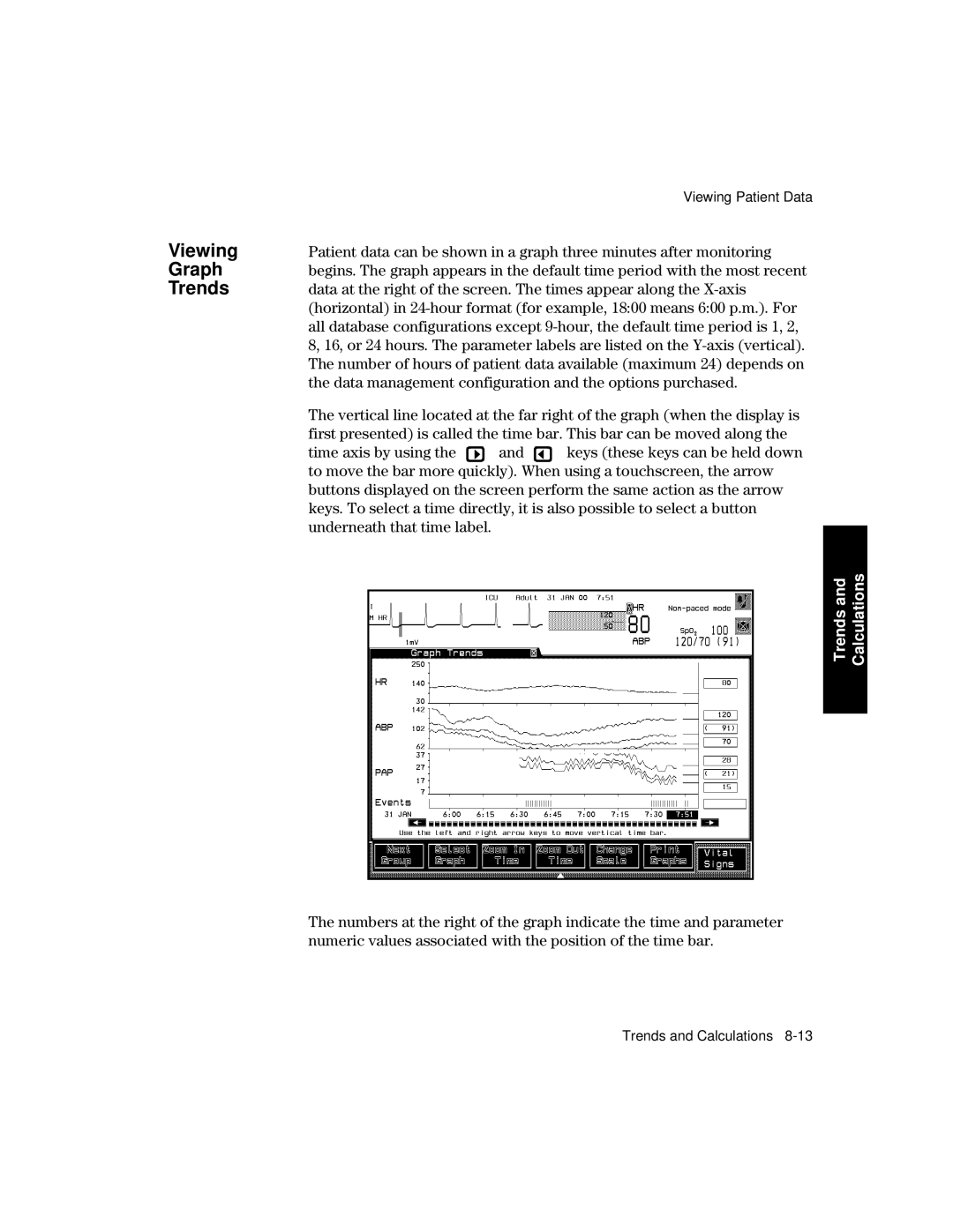
Viewing Patient Data
Extended Database CMS only No. of Parameters Resolution Size
Blood Mea
Trending
Priority
Viewing
Calculations Trends
Trends and Calculations
Yellow
Status Monochrome Display Color Display Printout
Minute Hour Hours
Viewing Vital Signs
Vital Signs Interval Direction Graph Trends Span
Calculations Trends
Trends and Calculations
Trends
Selecting
Parameters
For Graph
Graph
Data management configuration and the options purchased
Up to five pre-configured screens can be displayed using
Calculations Trends
Trends and Calculations
Mark
Examination of the waveforms and calibration signals
Procedure to Insert a Calibration Pulse
All Pressures
Calibration pulse varies according to the wave type
MV square wave
Ohm M-shaped wave
Left Cardiac Work LCW
Performing and Reviewing Calculations
There are two calculation functions available
HemodynamicsVentilation
Trends and Calculations
Calculation Task Window for Touch Screen
Calculation Task Window
Trends and Calculations
Stores the resampled values at the current time
Pressing
Keys or
Scheduled
Printing Reports
Printing
Window Reports
To turn the scheduled report capability on or off, press
Graph Trends Report
David Schultz
Vital Signs Report Blood Review Report
Not Print
What to Do
If Your
Report Does
Calculations
Drug Calculator
Calculations Trends
Aution
Trends and Calculations
Calculations Trends
Neonatal Event Review
Introduction to Neonatal Event Review
Viewing Neonatal Events
Followed by
Manual
Storage
Indicated by two or three event bars
Graphical
Details
Event Bar
Neonatal Event Review
Neonatal Event Review
Neonatal Event Review
Specifically by the user
This value represents the most severe value during an event
ABD =
AD =
BD =
Example of an Event Summary Line
Event Review
OxyCRG
Selecting an
Event
Viewing an
Summary Changing
Recording
Summary
Printing
Viewing oxyCRG Episodes
Neonatal Event Review
Jumps from one oxyCRG episode to the next in both directions
Episode
Printing an
Recording an
Selecting Softkey documents the selected oxyCRG
Associated oxyCRG episodes
Adjusting Neonatal Event Review Settings
Apnea Event
Settings
Criteria
Bradycardia
Listed under each event group
Operating In the Event Setup task window you can
Select items Change the item content
Selecting
Changing Item
Contents
Contents of an item
Data Transfer
Data Transfer Module
CMS
Data
Symbol Name Function Which Modules?
What is Transferred
Data Transfer
Transfer All Data to Module
Types of Transfer
To Module
Data Transfer
Data Transfer
Transfer Data to the Monitor
When a
To Monitor
Are automatically erased
Data
Transferring
Blood
Analysis
Scenarios
Blood Analysis
Data Transfer
CTS
Database
Combining Data
Time
Conversion
Transfers to the Monitor
Data Transfer
To the Module
Vital Signs, Blood Review and Graphs
To the Monitor
At calculation time
Indicator of time change
When the transfer is finished
Event Results
Troubleshooting
Back up Memory Time
Performance Specifications
Transfer
Transfer Time
Monitor Installation and Patient Safety
Philips M1026A Anesthetic Gas Module V24
CMS Acms Ncms
Monitor Installation Patient Safety
Aution
Source
Installation Information
Do not use a 3-wire to 2-wire adapter with these instruments
Earth interconnected with either monitor
Monitor Installation Patient Safety
Ment
Environ
Philips M1205A V24, V26, V24C and V26C
Care Operating Storage
Acms with Anesthetic Gas Module
Operating Storage
Up to 95% RH at 35C 95F Up to 90% RH at 40ºC 104ºF
Condensa- tion
Philips M1205A V24CT and V26CT
To 35C 41 to 95F 15 to 40ºC 5 to 104ºF
Explanation of Symbols used
Monitor Installation Patient Safety
Maintenance Frequency Source of Information
Maintenance Checks
Maintenance Checks
Failure and possible health hazards
Cables
Leads
M1046A Computer Module is a component of the M1165A/66A/75A
Controls and Connectors
Following diagram
Front
Rack Connector ECG Output P-p Module Connectors
Connectors M1046A Computer Module
Front Panel M1046B Computer Module
For 100
Connectors M1046B Computer Module
Rear Panel M1046A/B Computer Modules
Monitor Installation Patient Safety
Rear Panel Display Modules
M1092A/M1094A Display Module
M1094A
M1094B Display Module
Controls
M1092A
Connectors
Monitor Installation Patient Safety
Display
M1095A Display Module Controls
M1095A
Controls Connectors M1109A External Alarm Device
Rear Panel M1109A External Alarm Device
ITE display
Shown in the following diagram
Rear
M1026A Anesthetic Gas Module
Line protection fuses, T1.6 H Anesthetic Gas Exhaust
Monitor Installation Patient Safety
Lifting the Display Module
Connecting the Anesthetic Gas Module
V26 Connectors
Monitor Installation Patient Safety
Assembling V24 V26
78599AI-#J20
78599AI-#J06
78599AI-#J10
Monitor Installation Patient Safety
Battery Information V24CT and V26CT
AC and DC Battery Operation
Amber LED
Line power for an initial charging cycle
AC power is indicated by Green LED indicator
Operating Instructions
Up to 30-40% Flashing Off
Information V26CT Battery V24CT
100
Battery Indicator and Messages
Information V26CT Battery V24CT
External Battery Charger
Battery Care and Maintenance
Handling
Care
40488A 12 Volt Lead-Acid Batteries M1278A Battery Charger
Information V26CT Battery V24CT
Maintenance
Alcohol
General cleaning of the System
Soaps
Ammonias
Maintenance
Phenol based
General Disinfecting of the System
Based Aldehyde
Based Bleach
Maintenance
Monitor Maintenance
Procedure Frequency Source of Information
Monitor
Inspect
Inspect
Exterior
Maintenance
Perform a System Self Test
Performance Assurance Checks
Maintenance
Check
System Self-test Values Module Test Numeric Test Waveform
Overview
Auto Check None
Performing ECG Module
Self-Test
Module Test Numeric Test Waveform
Module Self
Performing Invasive Pressure
Self-Test None Auto Check None
Performing NBP Module Self Test SpO2 Pleth Cardiac Output
TcpO2
Malfunction is given refer to the Troubleshooting Chapter
To the normal monitoring mode
Performing
25 rpm
Press
ET CO2 40 mmHg 6.0kPa
MmHg 0.0kPa
Base Self Test
Manage
Ment Data
Tests for VueLink Module and Anesthetic Gas Module
Maintenance
Index of Volume
Page
With Data Transfer, 10-6 monitoring network
V24 and V24C Patient Monitor getting started, 2-1,3-1